
Every year, website design and user interface change slightly; 2018 is no different, with trends emerging in design, typography, and colors. To design a website that can compete with the millions of other similar websites out there, it is important to be aware of the newest styles and most popular methods. Here are some of the emerging website trends of 2018.
- Broken Grid Layouts
Website designers have relied on grids to create organized, reliable websites. However, 2018 is bringing around a new layout that is taking over. Broken grid layouts blur the strict lines of normal grids, while still retaining some structure. Images and text slightly overlap and are mixed together on the screen more fluidly.
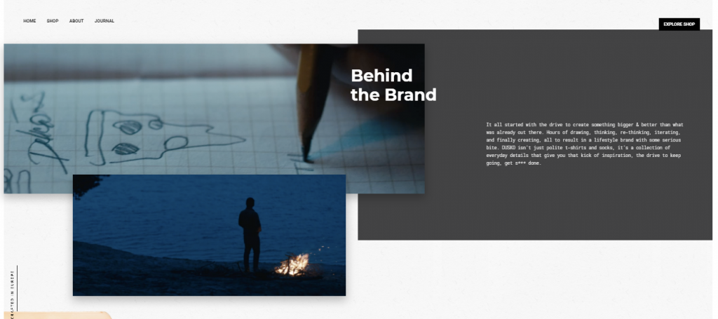
For example, the Dusko website has overlapping images with navigation tabs and text in various areas of the page, sometimes layering over multiple images.
- Importance of Illustrations
Images have always been a central part of any website. They are usually more eye-catching that text so designers are encouraged to use them. 2018 designers are beginning to introduce a new type of image into their websites: illustrations.
Most website images are either photographs, product shots, or gifs. Though they are all appealing options, illustrations are becoming more and more prominent. Illustrators are becoming important parts of many website design teams, as their work is sometimes showcased on the home page.
Illustrations are also helpful with brand interpretation. If you take a photograph of a person and put it on your website, that person is a representative of your brand. With an illustration, you can have an image of a person be simply a human being, not someone specific that personifies your organization, a statement that can be risky for a website’s image. If visitors feel like you are targeting another type of person, they are less likely to stay on your website.
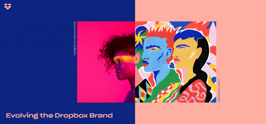
The Dropbox website utilizes illustration beautifully. The page has an image that is composed of half a photograph and half of an illustration, both of women. The result is an extremely intriguing, visually appealing image that immediately draws the visitor in.
- Larger Variation of Shapes
For decades, website designers would solely use sharp corners, rectangles, and squares in designs. It provides a neat, organized look. However, 2018 websites are sporting rounded edges and more organic shapes. Twitter, for example, provides a box with rounded edges when someone is intending to compose a tweet instead of a rectangle.
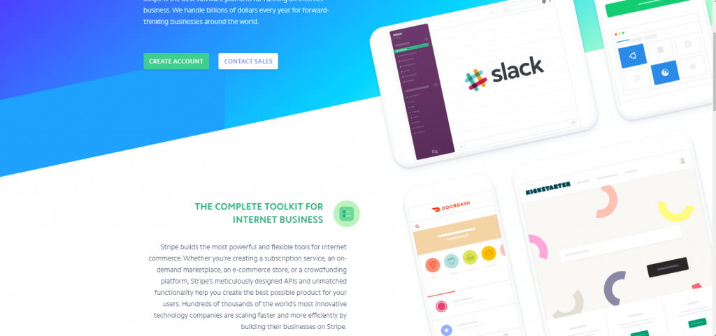
All shapes are changing. Website designers are more freely using amorphous areas of color, bright diagonal lines, or a variety of other more organic patterns. Designers are also playing with perspective. For example, Stripe’s website is organized with diagonal lines and tilted shapes that give the visitor a unique visual perspective.
Many websites are also using flashing or bright colors. Though it can be extremely visually stimulating, it is a risky choice. You want your website to be accessible to everyone, including people with disabilities, some of whom may have sensitivities to flashing lights.
- More Interactions and Animations
Interactive and animated websites have become extremely popular in the last few years. 2018 is intensifying the presence of these qualities. Many websites are full of animations. If designers use animation correctly, it can guide visitors to pay attention to certain things at specific times, thereby helping guide users to the appropriate content.
The Black Sheep Agency has a website designed so that when you scroll down, words are automatically highlighted. This keeps readers focused on the content because they are intrigued by the interactive qualities of the text. As you continue scrolling, bubbles pop up with pieces of information.
There are two significant animation and interaction patterns that are appearing: scrolling rates and page transitions. Some designers are creating websites where images will move as you are scrolling. For example, Anna Eshwood’s site has the images float up as you scroll past them. Page transitions are animations that happen when you leave or enter a page.
Through interactions and animations can be extremely effective, they can also be overwhelming. It is important to avoid using them too much because it may make users frustrated or anxious.
- Floating Navigation Menus
A standard part of most websites is a navigation bar cemented at the top of the page. However, designers are starting to create websites with floating navigation menus. The menu is slightly detached from the top of the window and floats a few centimeters below. The intent is to give the user a feeling that navigation is a universal topic that will stick with you throughout your experience on the website.
- More Multimedia Longform
Writing long pieces is often exhausting, so the thought of incorporating sounds, videos, and images in proper places among the text is unappealing. However, some designers are now taking the time to break up chunks of text with relevant videos, images, or sounds to make it more interesting for viewers.
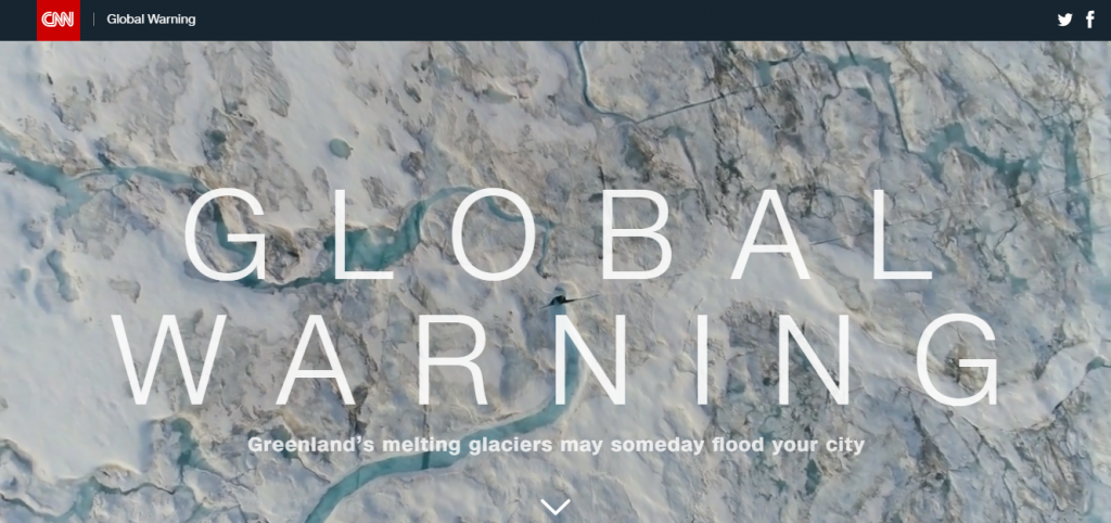
CNN, for example, has a feature on global warming that includes multimedia strategies. Words are centered in the middle of the screen while, simultaneously, sounds play in the background and a video of a natural element plays. The words are still clear and easy to read, but it is significantly more intriguing because there are so many factors involved in creating a sense of global warming.
- Focus on Diversity and Inclusion
Social dynamics and discrepancies have taken the forefront in all aspects of society, including web design. Many web design teams are realizing the importance of wording or images of race and gender representation. For example, people are re-visiting how many options for gender they offer on menus or other areas of their site. 2018 is bringing with it a new awareness of how each website is portraying race, gender, sexuality, religion, and other social and cultural aspects of the world.
- Switch from Text to Video Is Continuing
On websites everywhere, publishers are switching to video. For example, Facebook and Instagram offer stories where people can start live videos, almost identical to Snapchat’s strategy.
Though video is becoming more significant, it is important to remember that text is still the foundation of all websites. The text is the ideal form of online communication because:
- It’s cheap
- It’s quick to produce
- It’s still the primary format of communication on the internet
- Varying Fonts
For years, web designers only used a handful of fonts out of concern that websites would become overwhelming, unprofessional, or give the wrong idea. 2018 re-designs, however, are accompanied by varying fonts. The internet is now covered with a wide array of different fonts and styles.
Apple, Microsoft, Google, and Adobe are also creating something called variable fonts, which enable a new format for designing text. This gives you the ability to design a single font that behaves like multiple fonts.
- Improving Mobile Functionality
Mobile devices continue to grow in prominence. Many people use their cell phones to go online more often than computers. However, some website designs have trouble translating to mobile devices, leading things like images and videos to either not load or to load incorrectly. 2018 websites are making an even more active effort to ensure that the design is compatible over multiple devices so that people can access the website in many different ways.


