What parts of a city do locals know are interesting, but are off the beaten path of typical tourists? Now that a growing amount of photography has been enriched with public data, questions like that are something we can tackle in new and interesting ways.

Photographer Eric Fischer has created a number of interesting data visualizations using geotagged location data on photo sharing service Flickr. His latest project compares the locations of photos that were taken in major cities by people who have posted there for a short time (tourists) vs. those who post there for a long period of time (locals). The results are striking and fun.
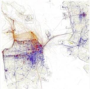
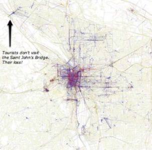
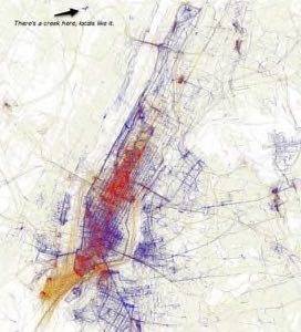
In the photos below, blue is where photos were taken by locals, red is where photos were taken by tourists. Fischer has graphed photo distribution for 81 cites and explained his methodology on this Flickr page. We learned of the project through one of our favorite new location blogs, Jonathan Crowe’s The Map Room.
This is an amusing example of the kind of insight that becomes possible to derive from a world instrumented with data. Go team social web!
San Francisco
Portland
New York
In the visualization above, yellow markers could be either tourist or local.
What other pivot points can you imagine comparing location and photos with? Duration of proximity by photographer is a pretty neat one.