
Congratulations, you’ve finally convinced the powers that be that your next Web-design project needs to be responsive. It was tough work convincing them, but you can’t rest on your laurels now. The most critical decision of the project remains: how is your team going to build it?
Guest author Travis Sheppard is VP of Technology at BGT Partners, a 2010, 2011 and 2012 Ad Age Top 15 Best Place to Work in the U.S. BGT creates interactive marketing and technology solutions for global corporations that strengthen brands, develop more engaging relationships and transform businesses. For more information on BGT, please visit www.bgtpartners.com, www.facebook.com/bgtpartners and www.twitter.com/bgtpartners.
Responsive Roundup
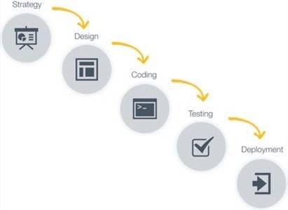
You’re probably familiar with the typical “waterfall” process: start with strategy, then onto design, followed by front- and back-end development and finally analytics implementation. The main attribute of the waterfall process is its linear nature: once a stage ends, the next one begins with a near-perfect dovetail. The progression through the stages only goes in a single direction, and unfortunately as problems accumulate, they inevitably flow downhill and changes are not handled very gracefully.
Waterfall process:
If you’re unfamiliar with the term “responsive Web design”, it describes a website-building process that utilizes the same set of code to display properly on desktop, tablet and smartphone browsers. Gone are the days of creating entirely separate websites in parallel desktop and mobile versions. Now you can construct an extremely flexible website to handle all environments.
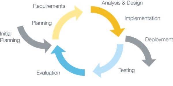
Responsive approach:
So why implement responsive design over the waterfall process? One of the biggest disadvantages of the waterfall is that little thought is given to design and development for environments beyond the standard desktop browser. An agile approach with responsive design considers these issues from the start, but will require more upfront wireframing, design and testing that are omitted in the waterfall process. Once implemented, your site will render properly on desktops, mobile devices and tablets.
Responsive approach:

So how can you implement responsive Web design in your organization? Below we’ll review the steps of the typical waterfall process and explain how they can become responsive.
How to Implement Responsive Web Design
Step 1: The Plan
Waterfall Process
In the waterfall process, wireframes are built and consist primarily of layouts and widgets. They’re set to a specific size (usually pixel-based), and have little room for flexibility. These wires promote very specific grid/layout sizes, but when the layout changes due to different screen resolutions, things will shift in transit. The results are that navigation menus become unusable, forms become inaccessible and your interface is rendered inadequate.
Responsive Web Design
The fix for this problem isn’t so difficult. You’ll need to design widgets for different views, and not think of a page as a “page.” Pages are not atomic units – instead, the sliders, content, forms and other components are atomic pieces making up the whole. Wireframes must represent different screen sizes, and therefore layouts must be fluid. They can go from three columns to two, and perhaps scale down into a single column for the smallest displays (mobile smartphones).
You’ll need to change the user experience as well – a slider cannot only be controlled by a mouse, but might require a user’s finger for interaction on smaller screen sizes. Wireframes need to become prototyping tools rather than blueprints, and some development and testing is needed to ensure they’re fully functional across the display spectrum. If design commences prior to this initial testing, then unknown development issues may arise at a later point. Regardless, the ultimate vision for the project must be sustained, so keeping lines of communication open between departments is essential.
Step 2: Design Time
Waterfall Process
In the waterfall process, the next step would be handing off the wireframes to design, and breathing life into them via fonts, colors, spacing and other tools of the craft. Oftentimes, there is some back and forth on design direction, with updates to the design comps made as more knowledge about the brand and its design guidelines surface.
Responsive Web Design
To make better use of allotted project time and resources, design should include a few layouts and widgets at different sizes. Responsive Web design means letting go of pixel-perfect designs. Making those designs work on desktop browsers is challenging enough, but when we think in terms of flexible widgets on a flowing grid, the number of designs needed becomes manageable.
Let the medium of HTML enhance the qualities of the design using a fluid layout in all environments. Creating the states for each browser width is a huge waste of time – instead focus on the totality of the user experience. For example, ensure that the atomic components of a rotating banner are touch-sensitive on smaller mobile devices, and use an industry-recommended minimum size of 44 pixels to allot for the typical human fingertip size. The design of the experience is just as important as the look of the site on all screen sizes.
Step 3: Build It
Waterfall Process
With the waterfall approach, once the designs are approved by the client, front-end development ensues where issues regarding rendering on smaller screens could arise. Unfortunately, due to the linear nature of the waterfall, these unforeseen problems appear well into the project progression.
Responsive Web Design
In our agile and responsive process, the design must live on a flexible grid. The widgets need to be planned out and prototyped by the developers, and they need to be tested along the way. The code also needs to be optimized to ensure that the widgets are the smallest possible unit. The widgets can be easily inserted and removed from layouts that were not originally planned for, and testing these options grants peace of mind. Constant collaboration between the developer, designer and strategist circumvents issues with the inevitable changes. With the different members of the team on the same page, problems are identified and resolved earlier in the process.
Step 4: Testing Your Patience
Waterfall Process
The final stage in a standard waterfall process is to evaluate the site via unit and functional testing methods. Issues discovered at this stage may require the original vision to be tempered, and sometimes a new device that’s just hit the market can throw a wrench in the works. The strategy and design team members, who may have begun work on new projects, must be brought back in the loop to accommodate these changes, and more time must be spent on updates.
Responsive Web Design
In the responsive process, you need to test along the way on multiple browsers and screen sizes so any problems are revealed early on. Issues with the mobile environment, which don’t coincide with the wireframes, can be recognized, as well as the capabilities of the design on a number of different platforms. A working project prototype will be ready early on allowing clients to review sooner, making it a win-win for all parties.
Step 5: Rinse, Lather, Repeat
Waterfall Process
The traditional waterfall process doesn’t have a step where you iterate through the designs and the interface. Passing over minor details at certain stages of the project construction permits issues to arise and client-expectation conflicts. Despite consistent and timely communication with the client, until a presented working model is shown, the full gravity of these accumulated poor decisions is not known.
Responsive Web Design
With the responsive approach, the same amount of progress is attained and, as a bonus, there is live code for client presentation every step of the way. The discoveries made at these earlier stages will help drive subsequent stages and anticipate critical changes ahead of any deadlines.
In Summary
Adopting an agile responsive approach will free you from the constraints of the waterfall process. Your design and development will be streamlined, you’ll be more productive and efficient and your online brand presence will be maximized on all possible platforms and screens. The real challenge is breaking out of the waterfall mold and becoming a responsive organization. Follow these five steps and you might just say “bye, bye” to the waterfall and “hello” to responsive Web design.
Waterfall photo courtesy of Shutterstock.


