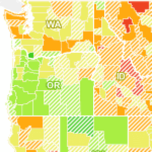
In the wake of U.S. President Obama’s speech on jobs last night, we present this mapping of Recovery Act spending. Development Seed, the same folks who mapped the famine in the Horn of Africa, have turned their attention on America.

Development Seed has mapped Recovery Act spending on a county-by-county basis and compared it with county unemployment figures over the same time period. So, does government spending have a positive effect in job recovery? That would be telling and we’re going to abide by the doctor’s prescription not to tell when you can show. The map is after the jump.
The change in unemployment over the last year is reflected in the colors, with red indicating an increase and green indicating a lower unemployment rate, or job growth. Counties that received under $10 million in recovery funds show a white hash pattern. The counties with the most spending – about a third – are shown in solid colors.
Dave Cole discussed the results of the mapping on Development Seed’s blog.
“Overall, it’s impossible to tell for sure how much recovery spending improved the economic situation, because we just don’t know how bad things could have been. It may be the case that without spending, this map would have a lot more red. Or maybe not. What’s interesting here is the local impact and information we are able to see from processing a few sets of open data.”
If you liked this, you may also be interested in the data visualization mapping Audrey Watters covers in her post for O’Reilly’s Radar. That one maps U.S. job losses by location since 2004.


