The famine eating up northeast Africa and threatening 13 million people is probably something you’ve seen out of the corner of your eye. A terrible thing, to be sure, but life goes on. Well, for some. Now, the World Food Programme has pulled open data from the United Nations, USAID and their own food distribution program and used mapping technology to enable us to visualize the data involved; to turn it, in fact, from data into knowledge, from data points to human beings and from what to so what. The resulting map is dynamic and easy to understand, if hard to digest.
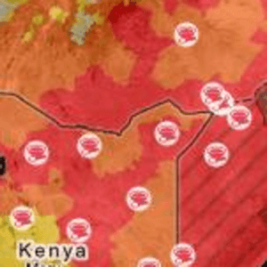
“In the map you can see what areas are most affected by the famine, where food is being distributed, and how much more funding is needed to meet the demand,” said Bonnie Bogle, of WFP’s partners, Development Seed, by email. “For example, you see that the most affected areas have limited humanitarian access, as they are in the al Shabab controlled sections of Somalia.”