Today, eMusic launched a major redesign of its site. The new design not only looks a lot fresher, but eMusic now also draws in information from Wikipedia, videos from YouTube, and photos from Flickr. EMusic is the second-largest online music retailer after iTunes, but it often doesn’t quite get the coverage newer music sites like Pandora or Last.fm get.

Most of the effort of the redesign was focused on the album pages. The homepage has been updated in a few spots, but the overall layout hasn’t changed.
In March, one of our commenters here argued that it was time for iTunes to become more social in the face of competition with Last.fm, Pandora, and the big social networks. While iTunes hasn’t taken up this challenge, eMusic has and this redesign is the first step in this direction.

Better Album Pages
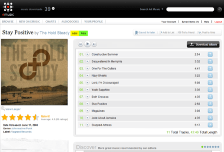
The new design for the album pages comes with a great number of usability improvements. It has now become a lot easier to bookmark an album or to add it to a list, for example. Both of these functions existed before, but they were relatively hidden.
Rating an album has become a lot easier too, as the ratings function, which also determines which albums eMusic recommends, is now immediately visible on the page, right under the cover art.
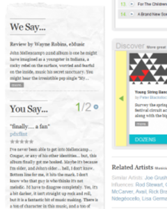
The new design also spotlights eMusic’s own content more directly, by putting editorial reviews and interviews into the left sidebar.
EMusic is also in the process of updating all its cover art and will slowly make high-resolution images available for all of them. The highest resolution available will be 1400×1400, which almost seems like overkill, but it definitely looks good.
While the focus of the new design was clearly on pulling in information from the web, eMusic also added the ability to send out information to Twitter, or bookmark an album on Facebook, Digg, reddit, StumbleUpon, Del.icio.us, and a number of other social networks and bookmarking services.
Dig Deeper
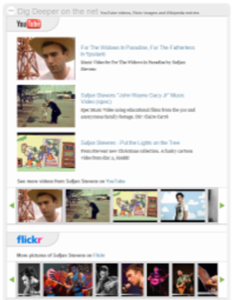
The most important part of the redesign is the “Dig Deeper on the Net” section, which is collapsed by default. It contains links to entries in YouTube, Flickr, and Wikipedia, all of which display right on the site.

When we talked to eMusic yesterday, they stressed that they were trying to replicate what its users were already been doing anyway – going out to the web to gather more information on their favorite musicians. Given eMusic’s focus on more obscure, independent bands, this makes perfect sense. Especially having the Wikipedia articles available gives users the option to dig a bit deeper into the history and background of an artist they might never have heard of before.
Verdict
EMusic’s users have responded overwhelmingly positive to the changes so far. In my own experience, the new pages are a major step forward in usability. Just within the short time they were available, I rated and saved more albums that ever before, simply because it has become so easy to do. The new design puts a lot more emphasis on being visually pleasing, yet it is very usable at the same time.

There are still a few minor problems on the new site, as some albums didn’t display user comments, some didn’t display cover art, and the Flickr images sometimes refused to close, but that is to be expected with a major redesign like this.
One issue with the new design, though, is that the user reviews are now less of a focus of the album pages. Whereas before, they would take up the bottom of the page, they are now squished into the left sidebar and only up to four of them are displayed at any given time.
Coming Soon
For the future, eMusic promises to launch a new feature every month for the rest of the year, including a new recommendation engine, an updated homepage, and new search features. If they turn out to be as good as this re-design, then eMusic is definitely heading in the right direction, though its subscription model, while keeping the cost per track down, will continue to limit its appeal for a number of potential subscribers.


