If you are a mobile developer getting to know what’s new in iOS 7, you’ve actually got it fairly easy. It’s the mobile designers who are banging their heads against the wall.
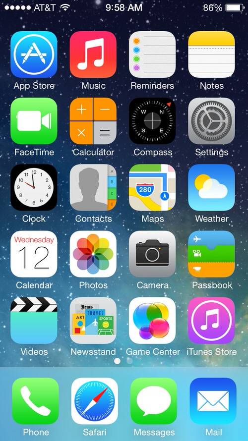
Everything app designers knew about the look and feel of iOS has basically been tossed out the window in iOS 7. Buttons no longer have borders, drop-down displays are translucent, icons are completely different. Designers are basically going to have to start from scratch with iOS 7 to make sure their apps fit with Apple’s new design guidelines.
It is about time too. On iOS, designers have had it easy for years as the basic user interface guidelines from Apple have stayed pretty much the same. Developers, meanwhile, had to deal with all the new features and functions that Apple released (Siri, Maps, AirPlay and so forth) as it iterated iOS through the years. Now, designers are getting their comeuppance.
Here are the major design changes in iOS 7 and some thoughts on how to get started implementing them.
(See also Sure, iOS 7 Looks Awfully Familiar—It Also Looks Like A Winner.)
9 Major Changes
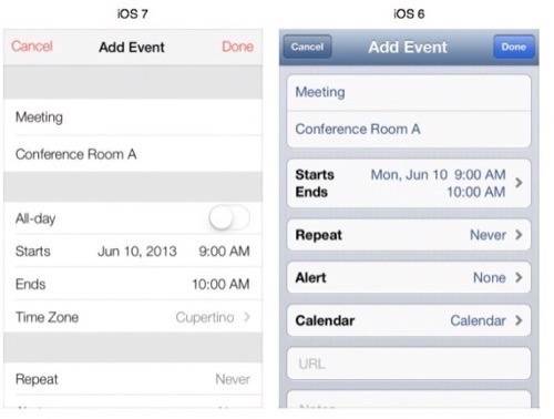
iOS 7 has gone “flat.” If you don’t know what that means, you are probably not a Web designer. For those who are not in the know, flat design eschews shadows and emulating physical objects in design (like a bookshelf for Apple’s Newsstand) for simple constructs. iOS has also gone skinny, with the font and borders line having a lot less width than before. The color scheme is a bit different, with black and white modes, hints of red, blue and pastel all over iOS 7.
iOS 7 has some nine major UI differences from its predecessors:
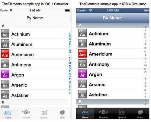
1. Flat Design – See above. You will notice that the UI of iOS looks quite different in how it is presented. Fewer soft edges, more thin, hard lines. Depending on your perspective, this could be an improvement.
2. Font – The “skinny” aspect of iOS 7 begins with using Helvetica Neue UltraLight as a primary font. You can see this all over the design, though Apple makes it fairly easy to change the size of the font for different purposes.
3. Icons – Icons have been changed significantly. Most have gone borderless. Icons are resizable for different screen sizes (iPhone vs. iPad, portrait vs. landscape).
4. Colors – To accommodate the flat and skinny, Apple updated its primary color schemes to be blue, red, white, black and… pastel.
5. Borderless – You thought that you had your buttons down? Well, all of them are about to change. Solid-color buttons are (for the most part) out of iOS 7, replaced by buttons that don’t have border edges and float on top of the background.
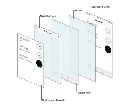
6. Layers – This is where advanced designers are going to have some fun. The new UI layout allows you to present several different layers in one screen of an app. So you can align navigation and tab bar views with a custom view hierarchy to create a cool new interface. Layers also help with the fact that much of iOS design employs translucent windows.
7. Translucence – Say you have the drop-down notifications menu sitting over your app. Users will now be able to see the general colors of what is behind that menu.
8. Gestures – iOS 7 knows when someone is holding the device, allowing enterprising developers to manipulate the interface in some new ways. Apple also introduced new navigation choices, including the ability to return to the last app you were in with a swipe from the edge of the screen. You will also be able to change tabs in Safari with end-of-screen swipes or flick between messages in email.

9. Status Bars & Menus – Menus, controls, navigation and status bars are different by definition of the flat and skinny styles in the new UI and the different color schemes.
(See also How To Download And Install Apple’s iOS 7 Beta.)
New User Interface Kits
If you are designing for iOS 7, there are three things you are going to get really used to: the new UIKit Dynamics, Text Kit and all the new features to implement the design changes in Xcode 5.
UIKit Dynamics – Helps improve user experience by incorporating real-world behavior into apps. New behavioral changes in iOS 7 include Attachment (specifying a connection between two objects and moving then dynamically with each other) and Push (different angles and vectors in how an app is manipulated). The UI convention for gravity behavior works on a coordinate system that charts points in the movement of the device. Understanding dynamics may be confusing at first, but it is one of the more interesting user interface elements in iOS 7.
Text Kit – The greatest aspect of the new Text Kit for iOS 7 is that it should allow designers to deploy text using significantly less code. Text Kit offers a high-level framework for handling text characteristics on pages and columns, around objects (like an image) and allows for designers to edit, display, store and create text.
(See also Apple’s New iOS 7: What You Need To Know Now.)
Upgrading Your App Designs
Apple has 900,000 apps in the iOS App Store. All built on iOS 6 or before. If that number includes your apps, it’s time to update.
This is where the new Xcode 5 Developer Preview will help. If you chose to create most of your buttons and menus and other simple functions using Apple’s standard iOS principles, then the Auto Layout function in Xcode will automatically update them for you. If you don’t use Auto Layout… well, time to get cracking on manually updating your custom design elements. You can, of course, also take a hybrid approach where you let Apple take care of the simple stuff and customize certain specific actions in your app. Many advanced developers take this approach.
Apple insists that every iOS 7 app do three things: update the app icon (120 x 120 pixels), update the launch image within the app and support Retina display with all artwork and images.
Apple suggests (though it’s not mandatory) that all apps adopt the translucent user interface elements, redesign custom bars, update background images to support borderless buttons and adopt dynamic types in the UIKit (see above).
If you think you can update your app and sneak it by Apple’s App Store review board without updating the UI, you are going to be very sorry. The design in iOS 7 is extremely important to Apple and a consistent look and feel across apps in the App Store has always been high on Apple’s agenda. As such, Apple offers three guidelines to keep in mind:
- Deference – The user interface helps users but doesn’t get in the way.
- Clarity – Everything (text size, icons, images) focuses on functionality through design.
- Depth – Layers and motion, “heighten users’ delight and understanding,” according to Apple’s UI Transition Guide.
That’s the primer designers need to begin thinking of updating app design for iOS 7. Make sure you familiarize yourself with all of Apple’s new guidelines before applying the paint.
(Read next: iOS 7 Development: Everything You Need To Know To Get Started)
