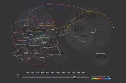
The travel geeks at Thomson have created a data visualization you can dance to. They tracked the top-level dance genres over the past century, and expressed the data as an animated map that moves from parent genre to descendant, proliferating over time.

The mapmakers used data from the books Bass Culture, Last Night a DJ Saved My Life and The All Music Guide to Electronica, as well as Wikipedia. They marked the birth of each genre in five year periods. As well researched as it might be, the exercise wasn’t without controversy, however.
Musical taxonomy is far from an exact science. Everything from your culture and geography to your age and personal tastes can affect how you draw lines of influence from one type of music to another. Thomson acknowledges that, asking for comments on the blog post where they debuted the map. The comments swing wildly back and forth from intriguing to goofy but are definitely worth reading. (For no other reason that seeing someone get really mad at the definition of a dance genre is super funny.)

Thomson blogger Osman Khan introduced the map as an incentive for travelers, Thomson’s clients.
“Music tourism (visiting a city or town to see a gig or festival) is on the rise. But why stop at gigs and festivals? Why not visit the birthplace of your favourite genre and follow the actual journey various music genres have taken as one style developed into another.”
I believe his inspiration was simpler than that. I believe Khan & Co. simply like to boogie-oogie-oogie ’til they just can’t boogie no more. Just a theory, of course.
Other sources: okayafrica


