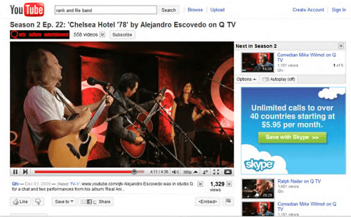
Today, YouTube migrated its user videos over to a new design. The design was available before now, and has been in development for months, but today was the day all the videos got their Sunday go-to-meeting clothes on.
In a January post, Julian Frumar, a YouTube user experience designer, commented on YouTube’s blog that the old design could appear “cluttered and a little overwhelming.” (Julian, by the way, is up for an Understatement of the Year Award.)
In the intervening months, YouTube has experimented with a cleaner design that made “the video the star.”
Other changes besides the focus on the video include a thumbs-up/thumbs-down rating system to replace the 1-5 scale, a finessed up-next video list, an easier-to-find subscription button and integrated video and text comments.
Is it a hit so far? Er. Nuh-uh.
On today’s YouTube blog post announcing the change, there were… comments – hundreds of them as invested users chimed in. And the chimes sounded pretty discordant. As of this posting, the word “suck” was used 14 times, “terrible” and “shit” tied at nine times each, the word “crap” six times and “bad” five times.
Lies, damned lies and statistics? Maybe. Representative comments included the following: “Looks like crap, keep up the horrible work.”
Firefox Twitter sentiment analysis gave the changes a 15-12 positive-negative rating. But TwitterFeel disagreed, with real-time analysis overwhelmingly negative.
