Luxurious stitched leather. A fine wood grain you can almost feel. An old-fashioned microphone. If you use Apple devices, expect to encounter less of this kind of thing decorating your apps and operating system.
After Monday’s big executive shakeup at the company, the interface design principles employed in the company’s software is expected to take a new, more modernist turn. Progress is good, but Apple runs the risk of watering down some of the familiar appeal that makes their devices so easy to learn and use.
Skewering Skeuomorphism
This design tactic, known as skeuomorphism, mimics familiar, real-world textures and objects in a digital interface. It’s something for which Apple has become known – and sometimes ridiculed – for using in its apps and operating systems. The approach has long been championed by Scott Forstall, who was shown the door earlier this week. Forstall shared his affinity for these faux-analog details with Steve Jobs, whose death a year ago paved the way for the kind of sweeping changes recently undertaken by his successor, Tim Cook.

Taking charge of the Human Interface group at Apple will be Jony Ive, the legendary hardware designer. Pretty much all of the company’s most successful hardware products – the iPad, iPhone, MacBook Pro and iPod Touch, to name a few – came out of Ive’s secret design lab in Cupertino. It’s that type of minimal, no-frills design that many expect to see more of in OS X and iOS now that Ive is in charge.
That means things like the stitched leather across the top of iCal and the faux notebook paper in Reminders could find their way out of OS X and iOS. Don’t expect elements like this to be wiped out with the next OS upgrade, though. Apple’s operating systems are used extensively by millions of people who have grown accustomed to how they look and work. If the skeuomorphic stuff is going to get axed, expect Ive and team to start by easout out the subtle details – the linen texture in the background of Notification Center, for example – replacing them one-by-one with cleaner designs that don’t attempt to mimic things in the physical world.
Why Skeuomorphism Isn’t All Bad
There’s been a bit of a backlash against skeuomorphic design elements lately, both within Apple and among designers generally. Designer Wells Riley has called it “the easy way out,” charging that skeuomorphism ‘helps people misunderstand the capabilities and limitations of digital products.” Fast Company’s Thomas Hobbs urges designers to move beyond the “silly” trend.
There’s certainly a case to be made that this type of thing should be used sparingly. Yet, at the same time, it’s easy to see how weaving familiar-looking textures and objects into digital designs can help make new ways of doing things more palatable, especially to new users.
“Skeuomorphism is about communicating and reinforcing feelings – getting an application to become a memorable experience, not just a tool,” writes Tobias Bjerrome Ahlin, an interface designer at Spotify. “It’s about communicating the purpose of a UI, not only the functions it enables.”
Skeuomorphism Has A Long History
Computers have borrowed visual conventions from the analog world for a long time. Since the dawn of personal computing, we have navigated through icons that mimic file folders, occasionally stuffing miniature pieces of paper into what looks like a tiny trash can. And yes, the calendar on my MacBook and iPad bears a resemblance to an actual, physical calendar.
In many cases, digital design that mimics analog artifacts can help foster a certain level of comfortable familiarity among consumers, who are spending more and more of their waking hours staring into screens. Maybe we actually need these familiar-looking things to be comfortable with embedding these devices this deeply into our lives.
iPhones and iPads comprise the vast majority of revenue for what has become the most valuable company on the planet. They’re clearly doing something right. It’s hard to see how stripping out these vestiges of the physical world could help Apple do even better.
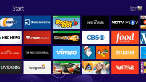
Yet Amazon has done quite well with its Kindle e-readers, which don’t go quite as far as Apple’s iBooks in mimicking paper books. And Microosft is drawing critical praise for the clean design of its Windows 8 interface, which makes few concessions to the past or the physical world. (It remains to be see how actual users will embrace the approach, however.)
The future may not lie squarely at either end of this debate. Perhaps it’s somewhere in the middle, where digital interfaces borrow subtly from the real world, but continue to innovate and feely abandon skeuomorphs when they get in the way.
At Apple, the visual language of iOS and OS X will continue to merge, possibly more rapidly than it already was. It seems clear that over time, it will have fewer accents of wood grain, stitched leather and fake glass. Will that make any difference? We’re about to find out.

Lead image of Jony Ive from Apple promotional video.
