We are now nearly a half-decade into the smartphone revolution. Millions of handsets and billions of app downloads later, the list of things mobile technology is changing is too long to fit here, and much of it is obvious. Why, then, is the state of city-to-city mass-transit mobility so horrifically bad?
As a full-time freelancer with family spread up and down the East Coast of the United States, I often have cause to travel. As a hyper-connected, multiple-gadget-toting kind of guy, I instinctively turn to my phone for information, communication and certain utilities. In some cases, the experience of finding a bus or train out of Philadelphia is sufficiently easy to do from my iPhone. In far too too many others, it makes me want to stab myself.
Mind-Boggling Mobile Design
When you navigate to Megabus.com in a mobile browser, you are thankfully redirected to a phone-friendly layout with big, bold touch points and clear text. It’s not beautiful, but it’s clean and simple, as any good mobile site should be.
The site architecture is a little strange, though. Two main navigation buttons perform almost the same function.
“Search and Buy” lets you query the bus schedule, pick a time and buy your ticket. “Schedules” has the same search interface, but when you find a bus, you can’t buy a ticket. To do that, you have to go to “Search and Buy” and enter your criteria all over again. What a delight! Why both of these navigation items exist is anybody’s guess.
Recently, I needed to buy a bus ticket from my phone. Megabus’s weird navigation was easy enough to get through, but then I hit another problem. While trying to enter my search criteria, I encountered an error message telling me I needed to select an outbound travel date.
Odd, I thought. I must’ve forgotten to put one in. So I tapped that field to reveal a crude but intuitive enough calendar widget and selected that day’s date. It automatically filled in the field with the appropriate numbers (something I wish I could have entered directly using my phone’s keyboard) and I was seemingly ready to proceed.
Nope. Same error. Tried it again. Ditto.
This may well have been a rare bug, but it was pretty annoying when I was trying to get to another city. In certain situations, people can’t afford even the smallest, most uncommon bug.
Dropping The Ball On Geolocation
I may have been the only person on the planet who experienced that issue, but the bare-bones Web form I was filling out raised bigger questions.
Why, for instance, did I need to tell this site where I was departing from? I was holding in my hand a tiny computer that knows my physical location at all times and tapping away at Web-based software that — if its creators tell it to — is capable of accessing that information and update itself accordingly.
My phone knows I’m in Philadelphia. And yes, I could be booking a seat for where I’ll be a month from now or getting one for a friend. In that case, don’t force me to choose Philadelphia as my departure city, but at least default to it so I have a starting point that feels more sensible than scrolling through a lengthy list of far-away cities and towns.

Megabus isn’t the only culprit here. Practically no mass-transit mobile sites I’ve seen use my phone’s location data to simplify the process of booking. When I go to the Bolt Bus mobile site, for instance, the first thing it asks me is what region of the country I’m in. Not even the city. The region. Am I in the Pacific Northwest, it asks? No. Obviously, I am not.
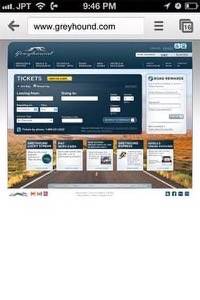
Which inter-city mass-transit line has the worst mobile presence of all? That dishonorable distinction would have to go to Greyhound which, shockingly, has no mobile site at all.
That’s right.
A nearly century-old transit company with 3,700 U.S. destinations and whose parent company makes $344 million in annual profits does not have a mobile site. And it’s almost 2013.
It’s Not All Bad — Local Mass-Transit Shows Promise
On the local level, there’s thankfully a lot more happening in mobile mass transit, thanks in large part to open data initiatives and inventive third-party developers and startups. It’s somewhat rare for that innovation to come from the transit agencies themselves, but it does happen. When it comes to getting from city to city, however, the mobile Web-based options aren’t anything to get excited about.
These sites aren’t all terrible. In fact, Bolt Bus’s mobile interface is pretty nice compared to its chief competition and it doesn’t have weirdly extraneous navigation buttons.
It’s not a particularly innovative interface (it uses the same mobile backend as Megabus and others), but purchasing a ticket is about as straight-forward as it can be, especially if you already have an account with Bolt Bus. Similarly, Amtrak’s mobile site is clean, easy to use and even somewhat app-like. It’s not mind-blowing, but it works.
Even the best examples of inter-city mass-transit mobile sites leave a lot to be desired. By now, organizations have a rich, if short history of truly beautiful, innovative mobile design from which to draw lessons. Each of us know a handful of mobile apps that have changed the way we get things done, communicate and entertain ourselves.
As is the case with all great technology and design, thoughtful new features are showing us just how inefficient life used to be.
Few things are as well-suited to be enhanced by mobile as the way we get from place to place. And to be sure, in a general sense, that aspect of our lives has already been upended, from directions on Google Maps to driving assistants like Waze and a host of urban transit apps that make it far easier to navigate subway lines. But when it comes to finding — and paying for — the best option to get from city to city, we’ve got a long way to go.


