Designer Nicholas Felton formalized his passion for personal infographics in 2005 when he issued his first
He tracked his time spent working, the countries he’d visited, his favorite books and even his favorite refreshment. The report was a mix of pie charts, bar graphs and lifestyle-based statistics. Today, Felton and friend Ryan Case have built a community site to help others track the day-to-day data that makes each of us individuals.
offers infographics for the masses.
Says Felton, “One of the appealing aspects of the Annual Reports is their tendency to make readers reflect on their own lives. After a few years of creating these reports, I realized that the methods I use to transcribe my activities have a greater appeal.”
Felton credits Case with proposing the idea of taking the methodology of the Annual Report and converting it into a website. Although the site is run by just the two employees, Daytum is already on its way to receiving its 1 millionth data entry. The two have also found a way to monetize the site by introducing a $4 dollar per month Daytum Plus plan with multifaceted privacy controls and the ability to add more data sets.
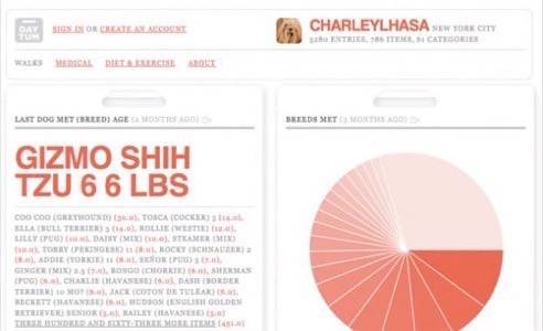
From tracking the daily musings of Charley the Lhasa Apso, to building CVs and building cases for donations and emergency relief – Daytum is offering users a chance to produce attractive charts in an easy-to-use interface.

While sites like Dopplr or Mint offer issues-based data visualization, Daytum helps us chart the things we want to reveal about ourselves.
Says Felton, “There is a lot of honesty in data, and better tools for recording and displaying information help everyone. This may be a greater knowledge of self and an accurate image of habits (good and bad), a more nuanced portrait of a person, or a macro-image of an event or issue. There is much to be gained from this transparency.”
To test the service visit Daytum.com


