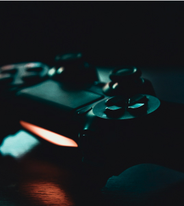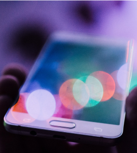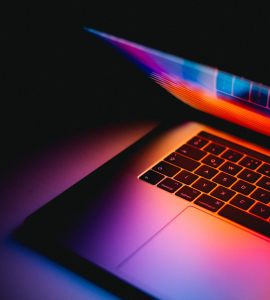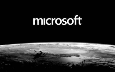
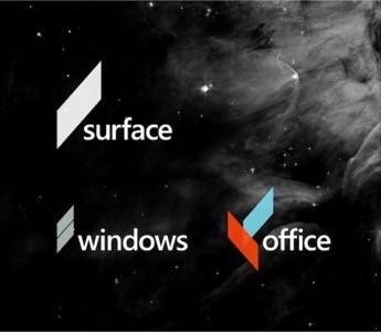
Los Angeles-based designer Andrew Kim has reconceived Microsoft’s strategy to propose The Next Microsoft. In a furious three-day marathon, he did what the company has been trying to do for years: reinvented Microsoft’s brand, dug it out of the past and brought it into the future. “I decided that Microsoft needs to be a brand that represents the future,” Kim wrote in a post on his personal blog. “Be slightly aggressive unlike Apple and Google’s friendly marketing. Promise to deliver the future today. Be almost like science fiction.”
Kim’s post is a visual critique of Microsoft’s corporate spirit as it is today. In a scrolling essay of bold images and few words, he tears down Microsoft’s stale image and unfurls a rebel’s banner of fresh ideas across the company’s present and future product lines.
The company has been struggling to recapture its former glory, and its current strategy is failing. Kim’s critique reveals some telling reasons why that might be and proposes a way out.
Kim’s post raises deep questions about what tech customers want and whether Microsoft (or its competitors) is giving it to them. We asked him some of these questions, and here’s what he said.
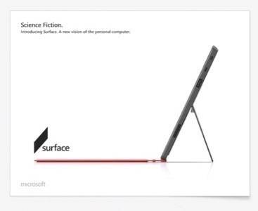
ReadWriteWeb: The aesthetics of Microsoft’s Surface presentation were striking. Where does your concept deviate from what they showed at the Surface launch, with the lasers, Tron colors, techno music and all that?
Andrew Kim: Any change is welcome with Microsoft at this point. My design deviates from their video in that it takes a more surreal and quiet science-fiction approach rather than exploding in your face with anger. I took inspiration from my obsession, Stanley Kubrick’s film “2001: A Space Odyssey.”
RWW: You draw a contrast to the friendliness of Apple’s and Google’s brands. Do you think Microsoft’s post-Surface messaging is particularly friendly or unfriendly? Or is their attitude ambiguous?
Andrew Kim: I don’t think we can decide what their approach is just yet, because the Surface is still largely unknown to the general public. I would wait until the introduction of Windows 8 to see if Microsoft is taking a new stance, in terms of its branding position. I predict they’ll take a more Cupertino approach.
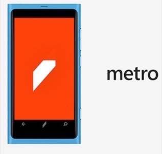
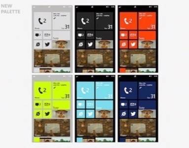
RWW: It seems as though you like Microsoft’s purely digital metro aesthetic, but you mentioned that the color choices are questionable. Color was an important part of the Surface presentation. What’s wrong with Microsoft’s colors?
Andrew Kim: Microsoftian colors are incredibly bright, primary and almost childish in color. Nothing wrong with that, but the company would benefit from a more sophisticated, less obvious color scheme. Metro is great, but the colors make me feel like I’m looking at something unfinished.
RWW: You said that you want this brand to be “about the future.” Describe that future – not just for Microsoft, but for the world around the Microsoft you’ve envisioned.
Andrew Kim: As a product designer, I see a future with more products that are efficient, purposeful and honest in their function. Like Apple products of today.
Peruse the rest of Andrew Kim’s striking images of The New Microsoft on his site, Minimally Minimal. Especially if you work for Microsoft.
