I needed a new meditation timer app for my iPhone, and I was not looking forward to browsing for one. The search for “meditation” in the App Store turns up a lot of garbage, and the app I had settled on before still had too much going on. But in the middle of the pack, my eyes fell on Mind, which had a striking, simple design that stood out from the rest.
It was free, so of course I grabbed it, and I was shocked to see how perfect it was for my needs. How could the meditation apps on the store all be so bad except one, and that one happens to be free?

As it turns out, Mind was a simple labor of love with an atypical App Store story. It was built by Fred Oliveira, just @f on Twitter, a full-stack developer and designer. He’s also an O’Reilly author and a mentor at 500 Startups. So I had to hear the rest of the Mind story.
“I built Mind mostly for myself,” Oliveira says. “I looked around for a timer app (for meditation as well as a Pomodoro Technique tool) that was as simple as it could be. The App Store was packed with apps that looked bad, were poorly designed or were just too complex.”
“So since building mobile and Web apps is what I do by trade, I just created my own.”
Keep It Simple
Meditation apps are a funny category. App-making is a business. Meditation is a practice of letting go of busyness. These two drives come into conflict surprisingly often.

It’s immediately obvious when a meditation app is just about making money; it costs too much for what it is (or it’s free and full of distracting ads), and the design shows no care at all. There are plenty of apps in this category.
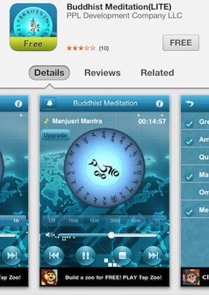
But even in the apps that are carefully designed, there’s often a problem on the opposite extreme. In order to justify charging for such a simple app, many developers feel a need to pack in as many features as they can. These commonly include tons of configurable chime sounds; multiple presets for lengths of time; crazy, changing artwork; and even analytics of your meditation performance over time.
But these features actually detract from meditation apps even more than mere bad design does. The quality of the apps is higher, so it draws people in, but all the bells and whistles — especially the analytics — create pressure to do everything “properly,” to make sure you don’t miss your daily stats, to fiddle with the chime sounds, and otherwise be distracted from what should be the simplest of all activities.
“Meditation isn’t about configuring a bunch of parameters. It’s about sitting,” Oliveira says. “I didn’t need a complex UI, a number of buttons, to help me track how long I sit.”
Mind Is A Tool
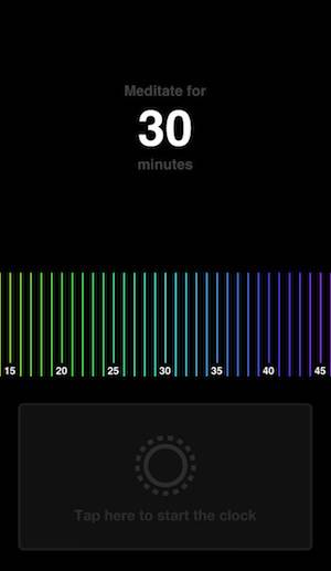
So Mind is the simplest meditation app it could possibly be, and that’s why it works. It has one screen. You swipe the colored time slider left and right to set the duration anywhere between one minute and one hour. Then you hit the button, the app prompts you to relax and focus on your breathing, and when it’s done, it chimes three times. It remembers your last session duration for next time. That’s all there is to it.

My favorite thing about Mind is that even the imagery is minimal. Meditators come to the practice from different traditions and with different aesthetics, so apps that commit to a particular kind of Buddhist imagery — or worse, some kind of fake pastiche of New Age-y Zen/Hindu/Hippie fusion — are disturbing to me. Mind, from its name to its icon to its full-spectrum colors, is a simple foundation built for anyone.
“I never intended to make money from it,” Oliveira says, “which is why it’s free today and will probably stay that way forever. It was easy to build, and is easy to maintain. The emails and thanks I get from people who use it are payment enough, to be honest.”
“I guess in the last few years I realized I’m a tool maker. Making tools is a calling. Mind is one of those tools. But I’ve built others before, and will continue building tools in the future. It makes me happy.”


