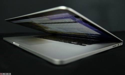
The Web is about to get uglier – that is, if you’re eager enough to plunk down $2,200 for the new MacBook Pro with its ultra high-resolution “retina” display. The new laptop, which Apple unveiled last week, already has Web designers and developers trying to figure out how they’re going to create sites and Web apps that look good on the new machine without leaving the rest of the Web’s population behind.
Graphics and Typography Need to Change
At the heart of the issue are graphics. The backgrounds, buttons, banners and gradients peppered across the Web were created with a certain maximum resolution in mind. As hardware evolves, so too must the Web itself.
It’s one thing for iOS developers to update their apps for retina devices such as the iPhone 4 or the newest iPad. The desktop, however, is a much more open, mature environment, with software created well outside of Apple’s guidelines. Then there’s the Web. It’s much older and bigger than the iOS ecosystem, which may lead to user experience issues and challenges for developers.
As soon as Apple announced the new MacBook Pro, the designers and developers at the mobile strategy firm Fueled started brainstorming about how this might affect their work.
“There’s a lot of interesting concerns,” says Fueled Director Ryan Matzner. “One is that a lot of screens aren’t going to be retina anytime soon, so we still need to worry about those guys. How do you serve images or graphics?”
Another issue, as Fueled designer Rob Palmer points out, is typography. One of the key advantages of these high-resolution displays is their crisp, highly readable rendering of text. That particular buck stops with the Web browsers, which are much more varied on the desktop than on mobile devices. Naturally, Safari supports retina-friendly text, but Chrome is still working on it, and other browsers will presumably follow.
Balancing Beauty and Page Loading Time

Creating bigger graphics is easy enough, but that raises a new issue: increased page load times. Outside of audio and video files, images are already among the largest assets a Web browser has to call up when loading a Web page. For image-heavy sites, swapping out higher-resolution images can have a substantial impact on page load, which in turn affects user experience and even search engine rankings.
To deal with this issue, Web developers can borrow from some of their tried-and-true methods. For years, websites have used browser detection to deliver different CSS stylesheets to different browsers. A similar approach is used to craft responsive designs – when sites load different layouts depending on the device being used to view it. Likewise, this sort of tactic could be used to handle graphics, Matzner says.
That’s exactly what they’re doing at O3 World, an interactive agency based in Philadelphia. To account for different screen resolutions, they’ve begun creating multiple sets of graphics, which are delivered dynamically, depending on the user’s screen resolution.
“This takes additional time from a planning and development standpoint and also from a QA point of view,” says Michael Gadsby, creative director at O3 World. “This in turn hits the client from a cost perspective.”
All of this thinking and planning is, for the most part, pre-emptive. The MacBook Pro with Retina display has barely begun to ship and isn’t exactly priced or even intended for widespread adoption. Still, this won’t be the last Apple device to launch with a retina display, and the company’s competitors are watching closely.
Photos by Eliot Weisberg.


