When I first reviewed Plurk for ReadWriteWeb, I had only been using this new lifestreaming service for a little while. After using it for much longer, I’ve realized that there is really just one major difference between Twitter and Plurk – but it’s that one difference that makes Plurk so much better.

This is a guest post by Muhammad Saleem, a social media consultant and a top-ranked community member on multiple social news sites.
If you think about the basic functionality, all micro-blogging sites offer more or less the same. You can create an account, add some friends, and then message back and forth (privately and publicly) and share stuff with each other. What Plurk does differently is the user interface and the effect of this change reverberates throughout the site. Here are the major UI changes and their impact.
1. The Timeline View

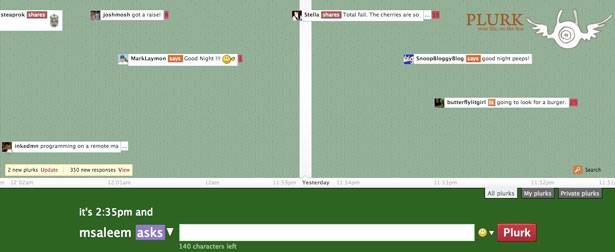
Not everyone has been happy with it but changing the way the information is displayed was a bold move, and ultimately the right one. The new layout performs exactly as expected. The timeline scrolls left to right, with the most recent data at the left. You can control the timeline using the trackpad or the arrow keys. Since the messages are arranged in chronological order, and because sometimes people send messages at the same time, this view also let’s you easily read a large number of messages at the same time.
2. The One Line Messages

Just like the timeline view, the one line message layout is such a simple idea that at first it’s very easy to not even notice it. But take a second and you’ll notice that Plurk displays the avatar, a qualifier, a message snippet, and the number of replies for the message, all on one line. Again this allows you to easily read or ignore a large number of messages based on who posted the message, what qualifier the user used, and how many responses the message already has. This way you can skip between messages as you deem important, rather than looking at conversations from a top-down view (like on Twitter).
3. The Red Flag Replies and Update Boxes

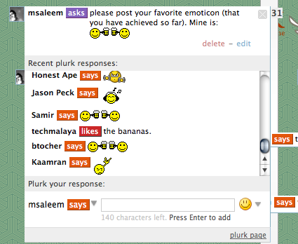
The best part of Plurk is the constant chatter. Once you log in and add some friends, it’s hard to get away. The reason for this is the way Plurk announces new activity to you. Unlike other services where you have to go looking for replies, on Plurk, every reply sticks out like a red flag. Every time someone posts a message you can see how many people replied to it, and with one click, read all the replies like a threaded conversation.

First, because the replies clearly stick out, you are bound to check them fairly quickly after they are posted, and second, because every Plurk message that is posted gets it’s own conversation page (where all the replies are threaded and easy to follow), more people are likely to reply to a message and start conversations. Finally, because your Plurk page isn’t static, and tells you every time you have new replies or your friends post a new message, you are more likely to check out what other people are up to (although at times of high activity this can feel like a nag screen).
4. The Inline Attachments
This one is a twofer. It is a user interface improvement but it’s also a feature. Unlike Twitter where you can just post link to media, on Plurk, whenever you link to a picture, song, or video, the media is immediately visible/playable from within the message and you can double click it to get to the original source.
5. And Everything Else

Finally, another great Plurk feature that most people forget about is that the design offers so much information but is never overwhelming or confusing to navigate. All the chatting and microblogging activity takes place above the scroll to encourage maximum engagement, while everything else (like user info and activity stats, friends and fans, and mobile links) is below the scroll and out of the way (I sometimes forget all that stuff is there).
Conclusion
That said, the problem Plurk faces is the exact same problem that Mixx faces. Though the site has a better service, they can’t match the same number of registrations or activity as market leaders simply because of the first mover advantage. People either find it too complicated (it’s not) or are too lazy (they definitely are) to transfer their entire network over to a new service. The problem is that no one wants to move to a new site unless their entire network of friends moves too. This means unless there is a mass migration, a majority of the people (though they are definitely testing it) won’t stay with the service in the long term.
In fact, even though I really like Plurk, I don’t use it as frequently as Twitter simply because all my friends are using Twitter more frequently.
You can friend me on Twitter and Friendfeed.


