There have been various sightings of a new design for Twitter this afternoon, though by now, Twitter has reverted back to its old design. Possibly, Twitter is testing this new design as it prepares to integrate Summize’s search into its current look. The new design moves the navigation bar away from the top and to the right side of the screen, making the overall look of the site more coherent and modern.

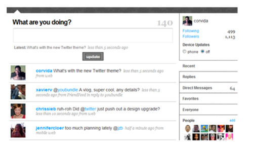
From what we were able to see in the short time the design was up, Twitter is mostly trying to streamline its interface with this new design – we did not spot any new features. The latest tweet a user made has been moved from the profile on the top right to directly underneath the text entry box. The ‘reply’ and ‘favorite’ shortcuts have been moved out of the interface and now only show when you hover over a message. The search box has also been moved and the empty space between the updates and the profile information on the right has been removed.
While the new design keeps the general feel of the old Twitter page, the new design is decisively more minimalist and clean. As Twitter is preparing to integrate Summize into its site, chances are that if they want to integrate Summize’s real-time updates, they would also have to redesign their front-end to be able to display those updates.
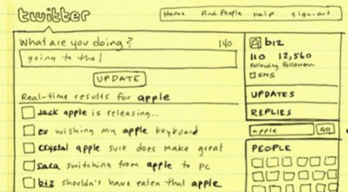
Interestingly, the redesign looks exactly like the sketch Twitter used in its post about the Summize acquisition. Judging from this, the integration with Summize might already be quite far along.


