To all hypochondriacs who
yearn to make their imagined ailments seem more legit, pay attention. There exists a
website that tells you what’s currently making people in your area sick. The website is
Who is Sick? and it has other uses besides adding
legitimacy to fictitious symptoms.

Who is Sick? is a Google Maps mashup, which as Alex Iskold wrote in
March is the most popular type of mashup. Who is Sick? attempts to track “sicknesses”
as they spread across an area.
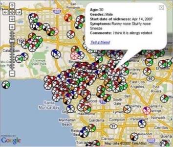
Users can enter their symptoms, which are mapped into six categories (including an
“Other” catch-all), their age, sex, days since experiencing the symptoms, further
details, and their zip code. The information is then fed into a searchable Google map.
The service is 100% anonymous.

As you can see, the map view can get a little crowded in populated areas. Thankfully,
Who is Sick? offers a search function that lets you cull further. Let’s say I live
in Beverly Hills and have had a runny nose and fever for a few days. Entering that
information, I can see that 31 people have experienced the same symptoms in the past two
weeks – 11 of them are female (I knew I shouldn’t have talked to that sneezing girl
at the bar!).
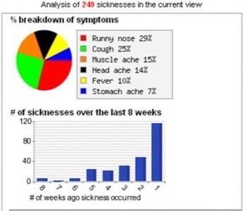
The site also offers basic statistical analysis of the illnesses making their away
around your area. A pie chart shows a symptom break down, while a bar graph indicates
visually how many new people are getting sick week-over-week. However, it’s unclear
whether a growing number of sicknesses indicates a passing virus or simply more people
using the site.

In the US the Center for Disease Control tracks illness around the country. Most
developed nations have governmental health agencies that track the progression of
sickness. They don’t, however, usually track the sniffles or localized illnesses
(unless severe or mysterious). They also get their information from physicians, which
means they only hear about illnesses that are bad enough to require a doctor visit. Who
is Sick?’s data is likely not as a reliable, as a result of coming from people who
may tend to exaggerate, but it could be more complete.
I think the best use of Who is Sick? would be for parents of school aged children, who
get sick a lot, to track what illnesses might be coming (advance warning that the stomach
flu is making its way through your kid’s school would certainly be welcome by most
parents, for example). Who is Sick? would be wise to provide a widget for parenting blogs
and websites that would allow parents to access data from the sites they’re already
visiting. I suspect that most school districts would not want to publicly encourage use
of the service, since it might cause parents to keep otherwise healthy kids out of school
for fear that they might catch something that’s “going around”. They might be
interested in the data, however, so Who is Sick? would be wise to make it available for
them in an easily digestible format.
Conclusion
Who is Sick? is an interesting and potentially useful mashup. One possible pitfall is
that it requires data from users; and going onto a website to report how one feels, which
is the last thing you want to do when you feel crummy. That’s why I think it might
work best as a service for parents – who can report on the symptoms of their children. It
might also foster a community of parents who can talk about what to do when their kids
get sick, or share recommendations for doctors. Which is probably better than a community
of hypochondriacs stressing about what horrible disease is coming their way next.


