Designing a mobile app can seem simple when you are sketching it out on the whiteboard. But when you actually sit down in your developer environment and get cracking, turning your ideas into reality is not always so easy.
That’s only the beginning, of course. What if you need to design your app for both the iPhone and Android? You will very quickly learn that you cannot just cut and paste your design from one platform to the other. Android and iOS frameworks share some basic principles, but when it comes to design, they are as different as ebony and ivory.
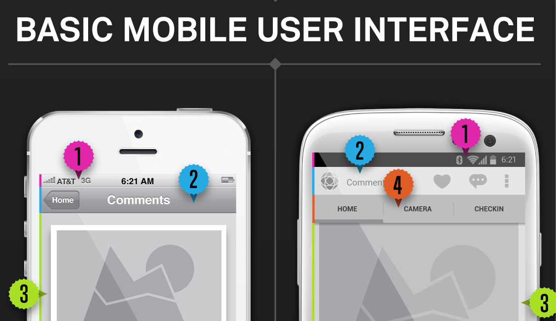
For instance, the notification bars in iOS and Android may look similar, but they perform different functions on each platform. And did you know that the action bar interface icon for iPhone is 20×20 pixels, while Android’s is 24×24 density-independent pixels? Do you know the difference between a pixel and a density-independent pixel?
Here’s a quick reminder, from StackOverflow: Density-independent Pixels – an abstract unit based on the physical density of the screen. These units are relative to a 160dpi screen, so one dp is one pixel on a 160dpi screen. The ratio of dp-to-pixel changes with the screen density, but not necessarily in direct proportion. Note: The compiler accepts both “dip” and “dp,” though “dp” is more consistent with “sp.”
Sometimes you just need an easy chart to remember these kinds of things. Mobile cloud-service provider Kinvey created a quick infographic going over the basics of iOS and Android design for easy reference when you are pulling out your hair trying to port your iPhone icons over to an Android app (or vice versa). Check it out below.

What are your biggest app design problems? Let us know in the comments.
