The concept of Linked Data has largely been the domain of academics and geeks. But this is a new time and space for the Web and the possible uses of Linked Data are becoming more widely recognized.
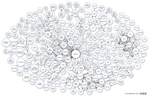
To illustrate the concept of Linked Data, Richard Cyganiak and Anja Jentzsch created the Linked Data Diagram of the Cloud. This image is widely used but it shows how much data has been added to the Internet in the past few years.
But first, let’s look at a definition of Linked Data by LinkedData.org:
The Web enables us to link related documents. Similarly it enables us to link related data. The term Linked Data refers to a set of best practices for publishing and connecting structured data on the Web. Key technologies that support Linked Data are URIs (a generic means to identify entities or concepts in the world), HTTP (a simple yet universal mechanism for retrieving resources, or descriptions of resources), and RDF (a generic graph-based data model with which to structure and link data that describes things in the world).
(Contributor: Tom Heath, including excerpts from Bizer, Heath and Berners-Lee (in press))
The image shows data sets that have been published in the Linked Data format. Contributions are from the Linked Open Data community project and various individuals and organizations.
Clicking the image takes you to an image map. Click on any of the circles and it will take you to the home page for the data set. The first cloud diagram was created in 2007 with one data set. Today there are more than 200 data sets.
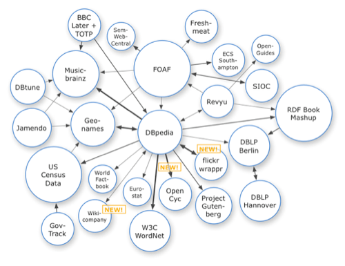
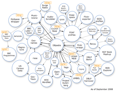
The size of the circle on the map correlates to the amount of data in the data set. Arrows and the thickness of the lines relate to the number of links and other associated information.
Here is the size of the Linked Data Cloud in 2007:
In 2008:
In 2009:
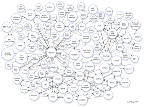
You can see how Linked Data has grown over the years. Its emergence is seen in the ways we can use the data to discover relationships in an variety of manners.
How big will this diagram be by the end of 2011? The number of data sets has pretty much doubled every year since it was first created. It should be no surprise if it doubles again 2011.
(Linking Open Data cloud diagram by Richard Cyganiak and Anja Jentzsch.)


