Silicon Valley design firm ZURB has just launched a free, simple Web design tool called Spur, which lets users play with a Web page or image and think about its visual design. The app is based on a ZURB blog post called “Critique a Web Page in 30 Seconds or Less,” which lays out some basic principles to evaluate the effectiveness of a Web design.

“Learning to view websites critically is an important skill to hone,” writes ZURB’s “fearless leader,” Bryan Zmijewski. “Too many companies spend needless time arguing over details of a website before the larger picture is fully developed. This puts users, and ultimately your business, at a disadvantage because the ‘big picture’ is what creates the users perception of your service or website.” Spur seeks to democratize these skills by helping anyone break down a Web page design to its fundamental visual elements.

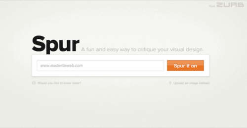
The landing page of Spur displays a toolbar to input a URL. There’s also a link to flip the toolbar to upload an image instead. After clicking ‘Spur it on,’ the app analyzes the page or image carefully while displaying an absolutely epic animation of a cowboy meandering across a field as the sun gently sets.

When the analysis is finished, a scrollable image of the Web page appears underneath the Spur toolbar, which offers a few tools for playing with the image to assess the design. The options are grayscale, intersections, contrast, blur, mirror, rotate and zoom.

Each of these lets you test the principles outlined in the blog post in different ways, and a drop-down from each button offers more information about what this tool can teach people who are new to design. Spur also provides a URL for the image for sharing and collaborating.
It’s very simple app, but it’s a thought-provoking introduction to thinking about the effects of visual experiences on the Web, which we may often take for granted.
What are some websites you think are especially well (or poorly) designed? Share some examples – maybe even using Spur – in the comments.


