Here in the US it’s the busiest travel day of the year and while media events and new product launches lay low, entrepreneurs and geeks are hard at work building the software that will launch in coming weeks. There’s no better time to kick back and let yourself get philosophical.
Social software is a whole new world in many ways and people everywhere are trying to figure out how to design effective and compelling applications. I offer for your consideration today three recent attempts to articulate social software design best practices. Let’s discuss.
Social Software Elements by Thomas Vander Wal
Thomas Vander Wal is the man who coined the term folksonomy, meaning classification through collaborative, social tagging. (His tagging tool of choice, you might note, appears to be Ma.gnolia.)
Yesterday Vander Wal posted the following slide from a presentation he gave this month in Stuttgart, Germany. Like any good venn diagram, there’s just a little to look at here but lots to think about.
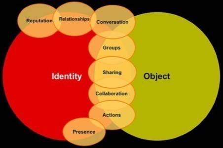
I’d gather, for example, that Vander Wal suggests here that conversation is one place where identity and objects come into contact, involving both relationships between individuals and group membership. If you and I are discussing a photo online, let’s say, then I’d like to know who you are, what groups you belong to and what our relationship is; if not explicitly then implicitly when that knowledge offers clear value to me. I think of it as a thought exercise, an opportunity to consider which factors in design to highlight for the sake of user experience. I’m sure there are other ways to read any single point of such a diagram, though. There’s some smart discussion underway already on Vanderwal’s Flickr page. Thanks to nonprofit tech consultant and North Carolina smart-guy Ian Wilker for posting Vander Wal’s slide.
OpenSocial’s Recommended Practices
Though I like to make fun of OpenSocial by calling it OpenWidget and saying it’s overhyped, there’s probably more meat there than I’ve given participants credit for.
One of the most interesting things to come out of it so far has been the OpenSocial “Social Design Best Practices.”
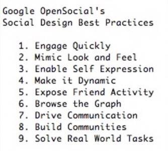
The recommendations include things like “focus on the 30-second experience; before distracting the user with expert features or sending invites, slow down and give the user a simpler taste of what your application is about.” That’s good advice that a lot of startups could benefit from considering.
Massachusetts design expert Josh Porter wrote about the Google recommendations on his excellent blog, pointing out that only a few are specific to social networking sites. It’s a good, simple articulation of social design principals. It may not be literally visual like the title of this post implies, but you can certainly use it for some visualization exercises.
Factory Joe’s Flickr Stash of Cool Design Examples
Factory Joe, also know as Chris Messina of San Francisco consultancy CitizenAgency when he takes his cape off, maintains an excellent collection of screenshots on Flickr. He saves all kinds of good examples of contemporary interface design in the social software world. I point people to it all the time, now you can too.

See also this collection of shots of websites implementing the Carousel design (like iTunes coverflow) from the Yahoo! Pattern Library.
I’m sure readers here can suggest other good screenshot collections for design consideration. These collections are a lot of fun to look at.
There’s So Much More to Explore!
It’s an exciting time in social media and design is a big part of that. There’s an infinite horizon in design alone but also factors like Adobe’s AIR and Thermo, not to mention the thrillingly tiny mobile world. The new web is supposed to be all about democratized participation (you can not only Read, you can Write to it too!) and usability will be an important part of making it not just sustainable but helping the web really live up to its potential.


