PayPal president David Marcus is in a hurry. He’s got new payments products to roll out—ones that will ease e-commerce, speed up real-world transactions, and spread PayPal’s reach in the apps on your phone.
So he’s got a new logo to roll out. Expect to see it a lot of places starting Wednesday—including, for the first time, in your living room, through PayPal’s first-ever American TV advertisements.
Hanging Up A New Sign At The Store
Who cares about a new logo, right? It’s easy to see PayPal’s rebranding as an exercise in corporate self-congratulation, the eBay subsidiary breaking its virtual arm patting itself on the back. Admittedly, Marcus has moved quickly on many fronts to fix PayPal’s problems, from its needlessly complex application programming interfaces to its user-surly customer service, as he told the audience at a ReadWriteMix event in January.
See also: PayPal’s David Marcus Has A Plan—And It’s So Money 3.0
Logos in the digital age aren’t just a matter of the sign at company headquarters, though. Everyone from app developers to online merchants to physical retailers like Home Depot and Jamba Juice to everyday eBay sellers display the PayPal logo to indicate they accept PayPal for payment. As PayPal mounts an aggressive push to refresh existing services and roll out new ones, the old logo was holding it back, Marcus told ReadWrite in an interview.

“The new in-context checkout experience that we’re rolling out globally [and] a bunch of new experiences across all of our products—as we push all of these experiences out there, we wanted to have a better identity with a new modern design,” Marcus said. “There’s a lot of integration that has to happen at the merchant level as well. We might as well do it at a time when we don’t have to go back to these guys and say, ‘Update your buttons because we have a new identity.’”
PayPal = People
PayPal’s original white logo got replaced by a blue version in 2007, and was updated with slightly rounder type in 2012. But those changes didn’t address the rise of mobile and the need for a simpler, more compact symbol that worked well on mobile devices, embedded within apps, and on storefronts.
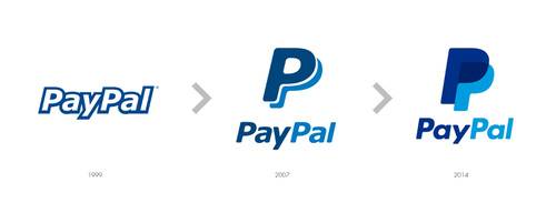
The new symbol combines a double-P “monogram” with a modified “PayPal” logotype. The monogram, which Marcus likens to Nike’s distinctive “swoosh,” is meant to allude to people coming together, a major theme of PayPal’s television campaign. It will also become the new icon for PayPal’s mobile app, and appear alone in other contexts as well.
“We also wanted to have a shorter form of expression,” Marcus told me. “That gives us a lot more freedom.”
PayPal’s thinking here reminds me a bit of the design process Google worked through in 2008 to find a new icon that would display well on mobile phones.
Marcus and his team worked with Yves Béhar’s Fuseproject, a design firm that has serviced Jawbone and Nivea, as well as earlier industrial-design projects for PayPal, like its in-store Beacon device and its Here credit-card swiper. The project kicked off in December—a fast timeframe considering the quantity of products and scale of change involved.
The new television commercial ads—as well as print, outdoor, and in-store ads—will start running this summer in PayPal’s major markets, including the U.S., Germany and the UK. (It’s not a global first: PayPal had previously run some TV ads in Australia, Turkey and Israel. Australia will also see PayPal’s new ad campaign.)
Here’s one of the new commercials:
And here’s a visual history of PayPal’s logos:
What do you think of the new logo? Take a poll: