The MIT SENSEable City Lab recently released visualizations of mobile phone call activity over the week of President Obama’s inauguration on January 20, 2009. The visualizations are of course stunning, but they also aim to answer the questions: Who was in Washington, D.C. for President Obama’s Inauguration Day, when did they arrive, where did they go, and how long did they stay?
MIT says that the objective of these visualizations was to determine how a city performs during a special event or a sudden emergency.
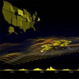
The visualization called The City illustrates what MIT calls “the emotional flow” of the Presidential Inauguration in Washington, D.C. MIT analyzed the number of mobile phone calls made in Washington D.C. on Inauguration Day and the home state or country of phone origin. What they found were “peaks of call activity as the crowd anticipates President Obama’s oath, a drop in call activity as the crowd listens to his inaugural address, and peaks again as the crowd celebrates the inauguration of the new President.” Overall call activity was 2-3 times more than usual, and it rose to 5 times the normal levels after 2 pm when President Obama took his oath.
One of the findings of this data is that the Inauguration was a multi-day event for many – there were marked increases in mobile phone activity on the Sunday preceding the Tuesday inauguration and mobile phone activity only returned to normal levels on the Thursday following the event.
The following version of The City features an animated map of the United States:
The World visualization shows phone data from international visitors who were present at President Obama’s inaugeration. There were people from 138 countries, over half of all the countries in the world. The top countries represented were Canada, Great Britain, France, and Puerto Rico. Those countries all had a fivefold increase in call activity compared with a normal day. In the U.S., the top calling states were also the country’s most populous: California, Florida, New York, and Texas.
How Can This Data Be Used?
These are all pretty ‘info porn’ graphics but, as we’ve questioned before with MIT SENSEable City Lab, what actual use are these visualizations?
Up till now, MIT claims, it has been “difficult to monitor urban dynamics in real time.” Traditional methods have been head counts, surveys, aerial inspection, and satellite image analysis, but they are “costly and slow to produce quantitative results.” The key to the approach demonstrated above is “to process existing information in real time from the telecommunications infrastructure.”
Real-time: that’s a term we’re hearing an awful lot of this year. In the case of MIT SENSEable City Lab, real-time data is largely obtained via mobile phone networks – which MIT regards as “a nervous system for the city” and which can therefore provide useful information and services to people.
MIT says that the real-time feedback loop from mobile phone data “has the potential to influence many urban functions and can help local authorities, service providers, businesses, and citizens themselves to improve the economic, social, and environmental sustainability of the places they inhabit.”