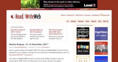
Last Monday we rolled out a new design on ReadWriteWeb and we received a lot of feedback on it, both positive and negative. Thank you to everybody who commented on the new design, particularly those of you who left detailedcritiques. I’ll address some of the feedback below, as well as update you on our comments system in general – which had technical issues during the week.
Overall I am still very happy with the design and it achieves the goals that I listed in the announcement post. But as with any Web development project, there is room for more iteration and some tweaking. So I want to assure you that all your feedback will be taken into consideration. Now to the specifics…
Comments Back Up; OpenID Coming!
Unfortunately we experienced some technical issues with the upgrade, which resulted in comments being either down or dysfunctional at times during the week. Comments are back up now and are working fine, although we are still working on OpenID and Vox integration. We are also looking to improve the speed of comment publishing. My apologies to anyone who left a comment over the past week and experienced difficulties. Normal service has hopefully now resumed.
The Controversial Logo
In regards to the design, our new logo in particular came in for some heavy criticism. I always knew it would get different reactions, but I was surprised and a little shell-shocked at the negative feedback on the logo. I want to reiterate that the boldness and emphasis on ‘RWW’ are an important part of the re-branding. Also note that ReadWriteWeb is a long name, which is difficult to pronounce and spell. So highlighting the capitals helps people remember it. All those factors need to be considered when you look at this new logo. However, given the feedback, it’s apparent that we need to do some tweaking to the logo – so that it both pleases our readers and meets our branding goals. We’ve already done some subtle tweaking to improve it. And we will continue to iterate on the logo.
Bugs; and Some Advice For Publishers Doing a Re-Design
There are also a few bugs still in the system, which have proven to be particularly thorny. These are a combination of browser issues (IE6 in particular) and Movable Type issues. These bugs have been a source of frustration for us all week. I had thought they’d be cleared up in the first couple of days after launch, but that hasn’t turned out to be the case – despite the hard work and long hours put in by our designers.
In hindsight, we probably rushed the new design out too soon – and as publisher I have to take responsibility for that. I was so focused on getting the new design up before xmas. So to all the publishers and designers out there, my advise to you is: don’t rush the launch.
Forest for Trees
In summary, despite the criticism and the thorny bugs, I think it’s important not to miss the forest for the trees. I thought David’s comment on the previous post (#75) summed up nicely what the new design achieves for ReadWriteWeb:
“If you like clean, functional, professional and bold design, you’ll love this redesign. It’s easy to read and has an openness that the last design didn’t have. The red is now isolated to the header and the rest of the page is clean. I like it! Don’t let the negatives speak for the majority of people visitng your site.”
That is my overall feeling too and if you look at the before and after screenshots below, I hope you’ll agree that the new design is much better.
Old RWW design

New RWW design

Summary : Iterate’s the Word!
I want to again thank our design team at Ideacodes for delivering a fresh, distinctive and modern design to ReadWriteWeb. It makes our site look more like a professional media publication, which is what it is these days.
But don’t worry, we will be taking into account all feedback in our iterations – the criticism as well as the plaudits. We recognize that there are things we can improve and tweak. So keep the feedback coming!


