This week Ask.com released a new user interface, which they nicknamed Ask3D. The vertical layout scheme looks very unusual for a general purpose search engine. However it’s aesthetically pleasant. But as well as the visual enhancements, the new vertical scheme has other wisdom behind it. Let me explain with this graph:
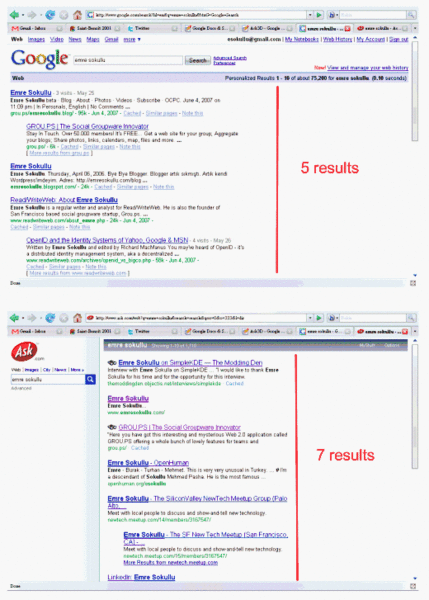
In the above examples, I queried my name “Emre Sokullu” on Google and Ask respectively. The results: Google gives me 5 results in the first page, Ask has 7. Assuming that most users don’t even scroll down, my satisfaction probability is 40% higher at Ask. You might think that people do scroll down, but past usability experiments have shown that most do not. Or even if they do, they do it very carelessly. Indeed users don’t just give up at the first page if they don’t feel satisfied, they also are likely to give up at the first eye shot if they don’t feel satisfied – this is a natural consequence of increasing user expectations.
But there are a few important parameters here. First of all, Emre Sokullu is a typical long tail query example. As the query approaches the head of the tail, Google and Ask return the same amount of results. But most of the time, while Ask returns 6, Google has 5. Consequently, the user satisfaction is approximately 20% higher. Also note that another important parameter here is a user’s screen resolution. The average mainstream screen resolution worldwide is 1024×768.
Overall, a small difference of ~ 80 pixels means a lot. Ask has basically increased the user satisfaction probability by a huge 20%, with just a UI change. This is a very good example of where user interface innovation in search may provide tangible improvements in the search experience.
The F-shape theory
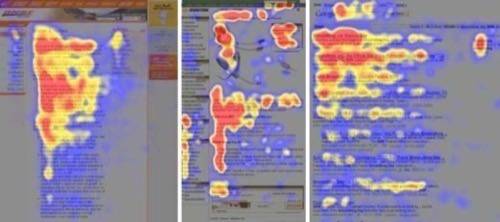
The heatmaps above represent the way users read different web sites. The interesting point here is the commonality of the F-shape reading pattern during the eye tracking studies. More about this interesting work is provided on Jabob Nielsen’s site.
This suggests that the current Ask interface has no conflict with the F shape pattern. The extra margin at the left side gets reflexively omitted by users, as shown in the first and second examples above.
Other Enhancements
The enhancements at Ask are not limited to UI. Additionally, in popular queries, the right panel can give you a shortcut definition from Wikipedia and other relevant results from images, videos, blogs and shopping channels. Therefore the chances of getting a relevant result at the first shot increases.
Customization
Last but not least, Ask has taken some courageous customization steps as well. It allows you to have your favourite desktop image in the background each time you visit the site. This is a feature that complements the current social networking and mobile phone customization trends. Just as you enjoy having your own background image on your cell phone, Windows desktop and MySpace page, you can now enjoy having your own background on your search engine page.
All of these fancy enhancements come at a price though – the pages get more and more bloated compared to the simple Google and Yahoo interfaces. Ask’s logic is to leverage the advantages of high speed broadband connections and expand in the US market mainly – where page download differences at that level are not even noticeable.
Conclusion
A few months ago, myself and our search czar Charles Knight had a discussion around the topic of UI innovations. My point then was that user interface innovations are not that important – the important thing is to make technological advances. I still advocate this idea and think a new search engine won’t ramp up significantly just because it brings a few UI innovations. However it is certainly a good idea to combine technological shifts with user interface innovations; or in some sense, feed technological breakthroughs with smart UI magic. And this is what Ask.com has done.


