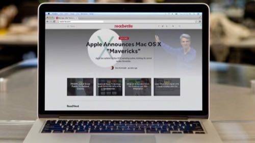
Here at ReadWrite, we’re super proud and excited to show you something really stunningly beautiful…
I’m sorry, for a second there, I got myself confused with an overly enthusiastic Apple executive.
You don’t need tech-industry bombast to state the obvious: ReadWrite looks different than it did yesterday—and we hope you’ll think it looks better. We call it ReadWrite 3.0.
Lest you think upgrading the site was a simple, push-button affair, imagine this scene: A war room of designers, engineers and editors gathered in a third-floor conference room at Say Media headquarters in San Francisco. The power goes out.
We regrouped at our homes and kept hacking away at the last remaining bugs. And right after we went live, a tech-ops engineer who stayed behind at HQ announced that the power had leapt back on. No one—not even Pacific Gas & Electric—could stop this launch.
Responding To The Responsive Trend

At a time when a lot of websites were still stuck in the desktop past, ReadWrite took a big leap last fall and embraced one of the transformative changes we’d been writing about—responsive design. Rather than design separate desktop and mobile versions or develop a flotilla of native apps, we created one version of our website that adapts to its environment—large-screen monitors, tablets, and smartphones of all ilks.
(See Also: How An Influential Tech’s Site Design Evolved Alongside The Web)
If you’re on a desktop, try resizing the browser window. Shrink it a little, and you can see what our tablet version looks like. Shrink it more, and it’s as if you’re on a phone.
It would have been easy at that point to rest on our laurels. But we and our colleagues at Say Media, our parent company, whose technology and design teams worked tirelessly on this launch, wanted to keep pushing our design forward and drop the remnants of the ’90s-era Web that clung to our site.
What’s New In ReadWrite 3.0

Speed. Your time is valuable, and we’d rather you spend it reading and writing, not waiting for page elements to load. We actually think this is the most important feature. (Your mileage may vary, and if you feel like we’re not delivering here, let us know.)
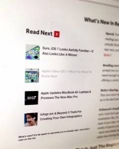
Reading cues. On the homepage and on article pages, we prompt you on what to read next. The ReadWrite site is actually smart enough to track what you’ve read, graying out links and offering a count of unread stories.
Better sharing. We’ve streamlined ReadWrite’s social tools. They now move with you as you read, so you don’t have to scroll up to the start just to share a story.
Enhanced visuals. The homepage now features bigger images and a look that’s generous to both gorgeous photos and earnest screenshots. But it’s the article pages—where we know you spend most of your time—that really sing. As editors, we now have a variety of layouts available that let us shape the design to the story—short news briefs, long features and everything in between—rather than forcing stories into a single, constrained template.
This Is Just The Beginning

If you’re into technology like we are, we know you think change is good. We have aggressive plans to keep adopting the latest tools. The neat thing I see happening, though, is that all these improvements are letting the powerful technologies behind the site fade into the background, bringing the stories and storytellers to the forefront.
What most excites me—sorry, there’s that word—is the potential to bring readers more deeply into that storytelling process. That’s coming, too. In the meantime, your participation in every imaginable form—comments, emails, tweets and links—is invaluable in shaping our reporting and analysis. Keep it coming. And keep us honest.


