I never know what to think when I see a rating next to a business on something like Yelp or Google that ranks a business as “$” or “$$” – how much is “$$” exactly and do I want to spend it? Well now, if you know you have exactly $12 on hand and you’re looking for dinner, you can look at Mint Data and find out exactly what the average bill at that new restaurant might be.

Mint Data launched today and is the product of Mint.com, the personal-finance management site. Mint Data aggregates anonymous spending data from Mint’s more than 4 million users “to deliver an unprecedented real-time economic index”.
“When we first crossed the million-user mark, we looked at the stories the anonymous, aggregated customer data could tell about the economy,” said Mint Founder Aaron Patzer. “Now, we have enough users in enough cities across America to give a distinct, anonymous look at the country’s economy down to the city level. What do we spend on restaurants? Which stores are a particular town’s favorites? How has the downturn affected things like coffee or bars? People may use the information they find to help them make better money decisions.”
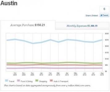
Mint Data is open to the public in beta beginning today and it’s worth a gander. It breaks down spending habits across more than 300 U.S. cities by category, specific business and as a overview of the city itself. For example, let’s take a look at Austin, Texas.

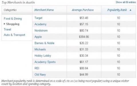
The city overview gives a general feel of Austin – how much you might expect to spend monthly on living costs and how much would go to food and dining, shopping, etc. Below the main graphical overview, the site offers a finer breakdown of these four general categories, including specific retailers ranked by cost or popularity.

You can see that Austin is a techie, outdoorsy town that likes to spend its money on outdoor gear and Apple products. (No surprise there.) But beyond getting even just a general feel, you can see each store and average spending. Clicking on a specific store shows an even finer level of detail.

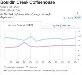
At this level of detail, you can see how the specific store compares with others of its kind and get an even greater feel for what you might expect to spend there. Like we said, never mind $ or $$, I want to know that the average charge at Bouldin Creek Cafe (one of my favorites in town) is going to be $11.69. Of course, this data should not be used on its own – if we did that, we wouldn’t know that Bouldin is more of a vegan restaurant than simply a coffee shop and we would assume that it’s ridiculously expensive, by the chart.
Talking with a friend recently about all the free Web-based services out there, we began discussing how they all make money, ad revenue aside. As the discussion wound on, we came to a concluding point – if you don’t know what the product is, then the product is you. While that can be a scary idea, we can hope that playing our part in providing anonymous, aggregate data can provide more helpful tools like Mint Data.


