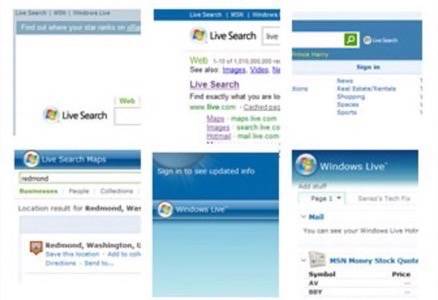
The LiveSide blog today took a look at all the different bits of Microsoft’s Live.com search universe and found that while the new look may live up to the stated design principle of “Simple and powerful. Human. Fast.” it doesn’t provide a common, unified experience. LiveSide found four different search boxes, two different Live.com “orb” logos (in four different sizes), and six different header backgrounds. While the slight differences in design may not be a very substantial issue, it is indicative of the confusion Microsoft has created around their Live brand.

In February of last year we wrote about the branding mess that existed around the Windows Live family of services, and Microsoft’s online branding strategy in general. At the time we quoted ZDNet’s Mary Jo Foley who pointed out that Live was sometimes used to brand services, sometimes to brand desktop products, and sometimes destination sites. Worse, at times single products have had multiple names and sometimes the Live branding resulted in very clumsy product titles, such as “Windows Live Search for Windows Mobile.” Live has also had a lot of overlap between products.

The Live brand confusion is something that Richard MacManus first wrote about on his ZDNet blog in 2006. Why then, hasn’t this been fixed yet? It has gotten better — MSN Hotmail vs. Windows Live Mail vs. Windows Live Hotmail seems have settled on the latter name, for example — but there is still a lot of overlap in the Windows Live family that makes it confusing for consumers.
When we were briefed a couple of weeks ago about the launch of Microsoft Live Mesh, we asked how the company planned to reconciled yet another file backup service with SkyDrive, Live Drive, FolderShare, SharedView, and Spaces, each of which have some amount of overlap at the service level with Mesh. The answer we got was itself confusing and muddled and basically boiled down to, those services can use the Mesh as their back end platform. The impression that we got, though, was that even people at Microsoft tend to be a bit confused about how the whole Live universe fits together.
The design differences across the Live Search sites highlighted today on the LiveSide blog may be minor, but taken as a whole they’re a good metaphor for the branding confusion that Microsoft has created across its collection of online sites and services. If designers in the search division can’t get together and decide on a unified design for a single family of Live products, it’s no wonder the Live brand on the whole has become so sprawling and muddled.


