The news of a large number of fish and then blackbirds dying at once in Arkansas was followed by news of more in Louisiana. Unnerving, the events led to a great deal of speculation as to the cause or causes, from gas leaking to radiation to the advent of the “end times.”

According to the United States Geological Survey, mass deaths are not in fact unusual and are usually unrelated. But once you start noticing something, you see it everywhere. So if you take your data mapped, here are a couple of options.
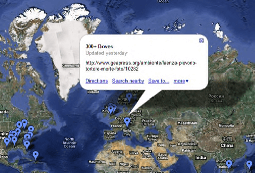
A Google map called Mass Animal Deaths was created yesterday.

This map uses primarily news reports to track everything from 300 doves dying yesterday in Italy to hundreds of jellyfish and starfish dying near Charleston, South Carolina last month.

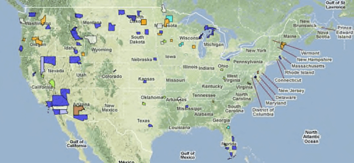
The USGS map of animal mortality focuses on the U.S. It is color coded for cause of death, ranging from bacterial to toxins to trauma. You can drill down to find out, for instance, that under 25 Lesser Scaup died in Snohomish County in November.
If anyone knows of any other significant map experiments with the die-off data, or other types of data visualization, please let us know in the comments.


