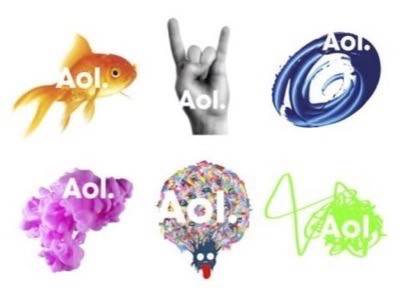
Late last night, AOL revealed a sneak peek at their new branding campaign for their soon-to-be standalone content-focused business. The rebranding effort will officially launch on December 10th when AOL begins trading on the New York Stock Exchange as a separate company from Time Warner, its current owner. The new logos – yes, there are more than one – feature a lowercase “aol” on top of various colorful images that range from an orange goldfish to a green scribble. The odd designs are definitely different than AOL’s “running man” or “triangle with swoosh” logos of years past – logos that became synonymous with the service that a large part of America once used to go online. But are the new logos any good? Or do they look more like the joke that AOL hopes it’s not becoming?
In order for AOL to survive, they’ve had to focus on becoming a content business instead of an internet provider and that’s exactly what the new branding is designed to reflect. Gone are the all-capital letters (“AOL”) which remind people of what they stand for (“American Online”). Now, there’s an uppercase “A” followed by lowercase letters and a period. This is meant to remind people that “there’s always something behind AOL,” says CEO Tim Armstrong in an interview with PaidContent. “The AOL brand is composed of many different things. The nomenclature of the dot is what comes after the dot.” In other words, AOL no longer stands alone. It’s Aol.music, Aol.Mapquest, Aol.Shopping, etc.
The new logos are just a preview of AOL’s revamped look and are meant to replace AOL’s swoosh triangle for good. The AOL “running man,” however, will stick around the brand in some form, although the company isn’t saying exactly where he will show up.
But the updated logos are a little off-putting to some. Noted technology blogger Om Malik of GigaOM posted his gut reaction Sunday night, calling them out as “lame,” “ambiguous at best,” and “as sexy as the obese, shapeless humans living on Axiom, the flagship of the BnL fleet in Pixar movie WALL-E.” Ouch!
But it’s easy to see where he’s coming from. After all, some of the logos look more like the sorts of doodles you would find gracing high-schoolers’ notebooks – like the hand doing the “sign of the horns” hand gesture. Really. “Rock on!,” shouts the logo, but it reminds us more of a middle-aged heavy metal fan reminiscing about their youth than the young, hip company AOL desperately hopes to become.
Then there is the pink glob. The best way to describe this logo is a fluffy wad of bubble gum. A green scribble looks like someone had trouble getting their ballpoint ink pen going and a generic blue swirl seems to signify nothing but a lack of imagination. What content sites are these logos even associated with? Your guess is as good as ours.
CNET calls the goldfish logo “cute” (sarcastically?), but AOL isn’t trying to build the next LOLcats empire, so maybe they should have forgone “cute” for something a little more meaningful and modern.
But that’s just our opinion. What’s yours? Let us know in the poll below.


