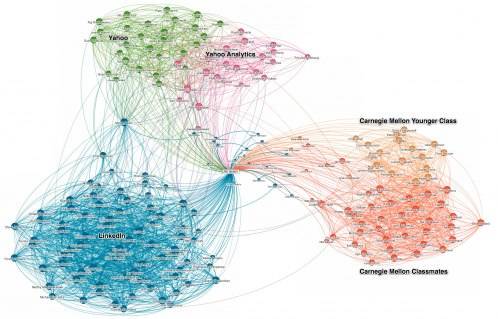
LinkedIn, the career-minded social network, unveiled a new feature today that helps users to visualize and interact with their professional network. Called “InMaps“, the feature provides an interactive visual representation of your professional network, helping you to see who you are connected to and how they are connected with each other.
Are you highly involved in a few specific sectors? Or do you move about professional circles like a nomad? InMaps lays it all out for you to see.

When you create your map, you’ll see different sections of dots (each one a person) in different colors. The colors represent different groups, according to associations. The larger the dot, the more connected that person is with others in your network. In my network, for example, ReadWriteWeb editor Abraham Hyatt appears to be the glue between many of my ReadWriteWeb colleagues. In another section of the graph, a former journalism professor is the common denominator.
As Ali Imam, senior data scientist at LinkedIn, explains in the blog post, this sort of visualized data can be useful for making connections and filling in holes in your professional social graph:
You can use those insights to measure your own impact or influence, or create opportunities for someone else. So, you might see two distinct groups that you could introduce to become one. Or, you might leverage one person to connect them to someone else. See an area that doesn’t look like it is representative of your professional world? Fix it by adding the necessary connections.
To access your own map, visit http://inmaps.linkedinlabs.com/ – though you need to have 50 connections and 75% of your profile complete to access the feature.


