Home [Infographic] Circular Design and Intuitive UX of the Samsung Gear S2

[Infographic] Circular Design and Intuitive UX of the Samsung Gear S2

 
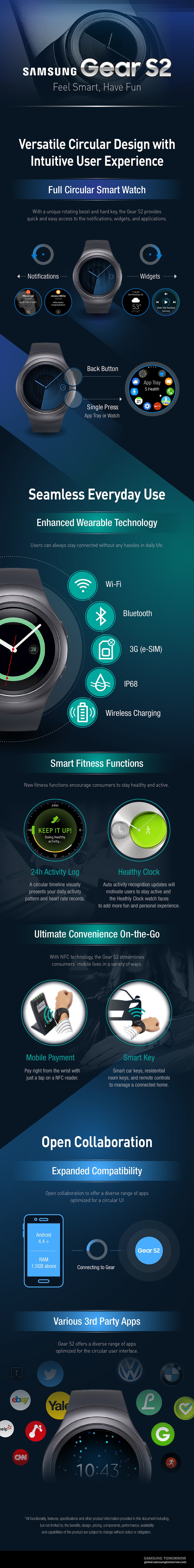
Hey it’s Infographic time once again and we haven’t had one for a while now. The Samsung Gear S2 has been showcased at IFA 2015 and wow, it’s a lovely looking device with a fresh new circular screen and user Interface in which you turn the dial for notifications or widgets. As well as the rotating bezel we have a home and back button to help you navigate around on the watch. I think that is enough from me, check out the Infographic for more details:


About ReadWrite’s Editorial Process

The ReadWrite Editorial policy involves closely monitoring the tech industry for major developments, new product launches, AI breakthroughs, video game releases and other newsworthy events. Editors assign relevant stories to staff writers or freelance contributors with expertise in each particular topic area. Before publication, articles go through a rigorous round of editing for accuracy, clarity, and to ensure adherence to ReadWrite's style guidelines.

Get the biggest tech headlines of the day delivered to your inbox

    By signing up, you agree to our Terms and Privacy Policy. Unsubscribe anytime.

    Tech News

    Explore the latest in tech with our Tech News. We cut through the noise for concise, relevant updates, keeping you informed about the rapidly evolving tech landscape with curated content that separates signal from noise.

    In-Depth Tech Stories

    Explore tech impact in In-Depth Stories. Narrative data journalism offers comprehensive analyses, revealing stories behind data. Understand industry trends for a deeper perspective on tech's intricate relationships with society.

    Expert Reviews

    Empower decisions with Expert Reviews, merging industry expertise and insightful analysis. Delve into tech intricacies, get the best deals, and stay ahead with our trustworthy guide to navigating the ever-changing tech market.