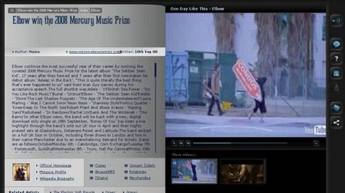
This fabulous idea still falls short in user experience.

Idiomag is a company we love to tell people about – it’s one of the most awesome ideas we’ve seen in a long time. The personalized music magazine site relaunched today with 4 times more content than ever before and a more traditional, link-intensive page design. Unfortunately, this great idea has serious problems in implementation and today’s redesign doesn’t appear to have solved those problems.
Here’s the basic story of how Idiomag works. The site asks for your user name on one of the most popular music social networks (Pandora, Last.fm, Moog, etc.) and then uses your publicly available taste data to build a personalized “music magazine” in Flash. The magazine combines videos from YouTube, photos from Flickr, MP3s and syndicated music blog content.
Idiomag looks at the color scheme of the video or photos accompanying an article and bases the whole page aesthetics on a complimentary set of colors. The service learns from your feedback and offers a new set of recommendations ever day.

We love the idea, but two years after Idiomag launched, we still return to the site begrudgingly today. We visit it at every opportunity, appreciating the music recommendations and hoping the rest of the site will get better.
Content is Hard
Why is it so unpleasant to go to Idiomag? Mostly because the syndicated text content from music blogs is awful. Most of it is really poorly written and the presentation is even worse. The Flash display of text from feeds misses punctuation, inserts spaces between letters in the middle of words – it’s absolutely unreadable.
We keep hoping that the next article served up will be free of overdrawn adjective soup or abrupt beginnings and topic changes. No such luck.
There’s obviously a world full of crappy music blogs out there, and we appreciate the MP3s they post, but Idiomag’s parsing for quality content isn’t working. The blog posts are placed very prominently on every page of the site and the whole user experience suffers as a result.
There are a lot of moving parts in the UI that make it unpleasant to use, as well. The first paragraph of every article is repeated as a “pull quote” at the top of the page, meaning you’ve got to skip the 2nd paragraph on every page because it’s the same as the first. There’s an independent collections of MP3s playing on all the pages, luckily they stop when a video loads, but they are no longer tied to the same artists as the articles and it appears that every article now has videos instead of photos.

We didn’t see any of the celebrated new content from partners like Billboard and Rolling Stone. As part of the relaunch today, Idiomag says it has quadrupled the number of articles it can offer – up to 11,000 per month.
Give it a try for yourself, it’s a great idea and maybe it will serve you better than it has us.


