If you have been interested in getting a feel for the upcoming release of iOS 7, but haven’t wanted to run a beta release of the mobile operating system on your Apple device, there’s now a pain-free way to get a taste of the iOS to come.
Apple’s iCloud, the browser-based cloud service that provides Apple ID account holders tools to supplement their mobile experience, has a new beta site that displays some of the new design elements of iOS 7.

Gone is the dark-grey linen background with shadowed icons that shouted skeuomorphism, and in its place is a much flatter, cleaner interface that leans towards a lighter end of the spectrum.
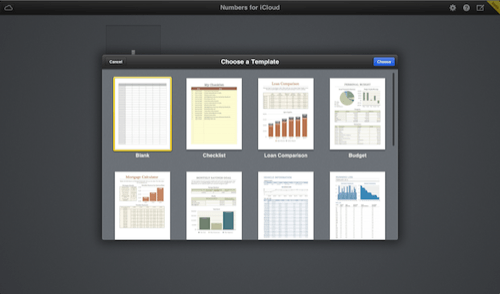
Six of the available apps in the beta iCloud site also show the iOS 7 look-and-feel (the three beta iWorks apps—Pages, Numbers and Keynote—are still mired in the current interface.

Poking around the apps, I found the overall design to be appealing. The Mail app was reflective of the changes throughout all of the updates apps: extremely clean lines, light design elements, and an emphasis on the text through the use of the sharp-looking Helvetica Neue font.
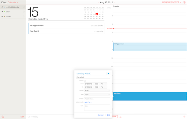
The Calendar app was especially nice: entering appointments is not rocket science for other calendars, but it was far more painless using the iCloud Calendar app.

One thing that kind of stuck out for me as I walked around the apps was the distinct reminder of another interface I’ve seen lately: Office 365. The color scheme on the Calendar app seemed the most overt reminder of the Office apps. This is not necessary a bad thing, but it’s definitely a resemblance, though slight.
If this is indeed the way ahead for iOS 7, then it’s a change to which I’m going to be looking forward. But I can’t help wondering how much effort it will take other app developers to get their apps’ look and feel to come close to this design.


