With all the attention focused on Facebook and Google, it’s sometimes easy to forget how many people visit Yahoo on a typical day. The site has over 700 million users and gets a massive amount of page views each day. As the company struggles to figure out what its future focus should be, one thing they’ve prioritized highly is content.

Every day, Yahoo displays about 13 million different news story combination on its homepage. Those stories are personalized based on demographic data and reading behavior, and the company keeps track of what kind of stories do well with which groups of people.
To do that, Yahoo utilizes a complex set of algorithms it calls the Content Optimization and Relevance Engine (CORE). The system crunches 1.2 terabytes of data per hour to determine which stories to deliver to which users. The result is a line-up of stories on the homepage that’s customized for each user, based on calculations that take milliseconds to crunch as the page loads. It also lead to a substantial increase in engagement on Yahoo’s site, where click-throughs to news stories have increased by 300% since this technology was first implemented.
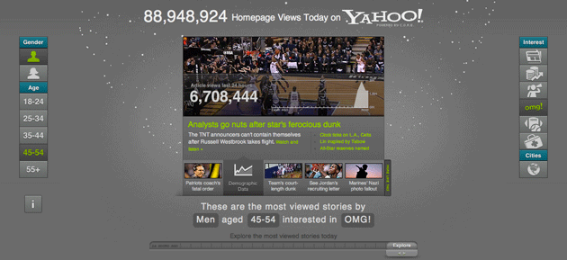
To illustrate how this works, Yahoo has created an interactive data visualization that shows visitor traffic data in nearly real time. Using it, one can drill down into specific age groups, genders and story types to see what people’s aggregate reading habits look like.
You can view and play with the data visualization here. They even designed the UI in HTML5 rather than Flash so you can check it out on your iPad.