The responsive design revolution is upon us. With tablet and smartphone use soaring and changing our media habits, Web publishers no longer have a choice but to build designs that work properly on any device or screen size.

The hard-working Silicon Valley design firm ZURB has recently released version 2.0 of its responsive design boilerplate kit called Foundation, which is a fundamental framework for a one-size-fits all Web project.

Foundation is a CSS and Javascript framework that comes with a boilerplate and the necessary plug-ins. It uses a 12-column grid that is both “fluid and responsive,” meaning that it flows properly in response to different or changing screen sizes.
It responds to percentage-based widths as well as media queries, so you won’t have to worry about how the layout will work on different screens or devices. The package even comes with the responsive typography, buttons, forms and tabs you’ll need.
ZURB is demonstrating Foundation on its Soapbox page, so you can play around with it yourself and see how well it works. Look at how the same page resizes to fit these two different browser windows:

If you visit the Soapbox page on your phone or tablet, you’ll see the page flow out the same way to fit the screen. Whether for prototypes or even full-blown sites, it’s great for the Web that ZURB has given us Foundation. You can download it from Github and go to town.
More Responsive Design Resources
It’s an exciting time to be a Web designer, because HTML5 and CSS3 are powerful new technologies, and everyone’s learning to use them at the same time. Jeremy Keith has written a book called HTML5 For Web Designers that will bring you up to speed on all of it, and you can read it on the sitefor free.
HTML5 Boilerplate is a great starting point for the very basics of how to build a modern, Web-standard, responsive site.
There’s also a service called Treesaver that has a similar implementation to Foundation, but it’s finely tuned for future-of-magazines-style content sites.
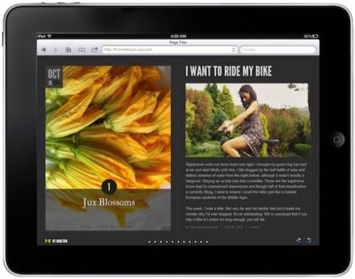
For those who don’t want to have to build their own platform, Jux.com is the way to go. Jux just released its new batch of code, and now it produces responsive designs that work on the desktop as well as the iPad.

It even lets users control the iPad version with touch gestures. It’s a whole new way of publishing that’s optimized for any device, and there’s no technical implementation to get in your way. Whatever your geek-level is, Jux will make your full-screen content pop on a desktop or tablet.
And be sure to check out Dan Rowinski’s story about the BostonGlobe.com design process, which is one of the best examples of responsive design around.

What are some of your favorite sites that look great across all devices?


