This morning Google unveiled minor tweaks to their search UI and expanded results. The ultimate goal of Google’s revamp is to unify search results across their properties to include web search, news, blogs, images, videos, etc. all in the main Google search offering. Google is calling this Universal Search and Danny Sullivan has an excellent overview here.

The changes to the search UI are, for the most part, inconspicuous. Google’s new search attempts to unify its different offerings by including links, where appropriate, to additional results. For example, a query for “ruby” will offer additional results from its blogs and code search engines, a search for “puppies” will not — but will offer results from the image search, which the “ruby” query does not do. A search for “Hillary Clinton,” meanwhile, will include results from Google News as well as things like video from YouTube (as below screenshot shows).

But how does it stack up against search sandboxes from competitors like Yahoo!’s Alpha, Ask’s Ask X, Microsoft’s Imagine Live, and even Google’s own test bed Searchmash?

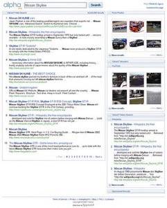
Yahoo!’s Alpha attempts to do essentially what Google’s new unified search does: combine results from across their properties. Alpha search results are presented in a two-pane display with results from Yahoo!’s web search, News, and Answers properties, as well as Flickr, and non-Yahoo! properties like YouTube (owned by Google) and Wikipedia. Alpha allows you to browse search results without page refresh. Non-web search results are presented in the right side pane in boxes that are closed by default. Interestingly, sponsored results are also presented in a box that is closed by default – meaning Alpha requires users to sort of “opt-in” to view advertisements.

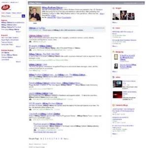
Ask X presents results in a three column view, with suggested searches on the left, web search results in the middle, and image, news, shopping, video, and blog results on the left. Ask X includes a lot of neat AJAX effects, like a fade transition between search results pages.

Imagine Live, the new search test bed for Microsoft’s Live search, uses a two column results display: web results on the left, images, news, related searches, and a rather cryptic “Local Results” map on the right. Seemingly irrelevant local map aside, Imagine Live has some nifty features, such as mouse over hover effects for images and news – that provide more information about the link, without needing to click on it.


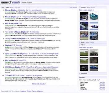
Searchmash is Google’s own search sandbox, where they try out experimental UIs before pushing them to the Google main page. Searchmash uses a two-pane results display, and (like Y! Alpha) the images, blogs, videos, and Wikipedia results on the right side are closed by default. Perhaps the coolest feature of Searchmash is the continuous scroll: rather than opening up additional results on a new page, Searchmash adds results onto the end of the current page.
Conclusion
It’s not really fair to compare Google’s main page to the test bed pages of other search engines, since test pages are just that: they’re what the search engines use to test stuff that may never see the light of day. When you have a huge audience of regular users you have to be very careful when you make changes, that you don’t turn people used to things a certain way off from your service (see the Yahoo! TV guide debacle, as an example of changes gone horribly wrong). So, Google and other search engines can’t just implement ideas presented on their sandbox pages without thoughtful research and testing into user behavior and how people will react to the change.
That said, in terms of the options presented here, I found Searchmash to be the best. It has a straight forward design (like Google), great results (like Google), and presented information in an easy to consume format. Yahoo!’s Alpha was not far behind in any of those respects, however.
What do you think, of today’s changes by Google or the experimental options discussed above? Leave a comment with your thoughts.


