When RWW webmaster Jared Smith sent me screenshots of yet another change to Google’s top navigation bar, I thought it was a bug. Then I got it, too. It’s a weird hybrid of the old, black nav bar with plain, gray text and the new, light one with the icons and Google search box. Sure enough, just now, Google announced the change, so it will be rolling out to all users soon.

The black bar, sometimes called the “sandbar,” only appeared in the middle of last year as Google began to redesign its interfaces, and the gray Google Bar was launched in November. Some users still have the sandbar, and others have the gray one. Now there’s a strange hybrid appearing, and it’s sort of the worst of both worlds.
The New Google Bar:

Old Google Bar:

The black bar worked because it was simple. The text links were clear, and the important services were all easily visible, with a drop-down at the end for the rest. It wasn’t pretty, but it was inoffensive and functional.
Old-New Google Bar:

The gray Google Bar was more visually intensive. When Google introduced it, it sounded like the point was to give the user back some space by removing the black band at the top. The gray bar contained a search box for the Google service you were currently using, and to navigate to other Google apps, you used this crazy dropdown menu:

The icons helped, but it still wasn’t fast to navigate, because you had to open the drop-down menus.
New-New Google Bar:

What we’ve got now is some kind of hybrid. The search box is still there, but the black bar is back now, too. Instead of the drop-down under the Google logo, it’s among the text links at the top, and the drop down is just a list of black words that descends in the middle of the screen.
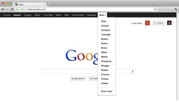
This inconsistency is starting to get crazy. Google’s navigation bar gets a lot of use, and it’s impossible to form habits with it constantly changing. The changes are inexplicable, too. Now the Google Bar is bigger than ever, but it doesn’t seem any easier to use.
What do you think of Google’s new, new Google Bar?


