Google updated its search app for iPhone today with a complete redesign that makes it more like the iPad version. This was already Google’s best iOS experience by far, and now it’s faster, more attractive, and consistent across devices. This month, it looks like search is back in the driver’s seat at Google.

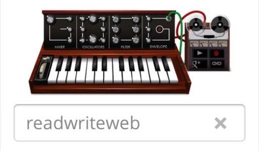
The start screen is now the same as on the iPad app. It is the classic Google search box reimagined for the touchscreen. It’s just a plain, off-white background, the iconic Google name (and even a mobile-friendly version of the day’s Google Doodle), and three other buttons: “Apps,” “Voice” and “Goggles.” Voice search lets you speak your query aloud, and it’s impressively accurate. Goggles lets you search visually using the camera. It recognizes text and objects, and it’s learning more over time.
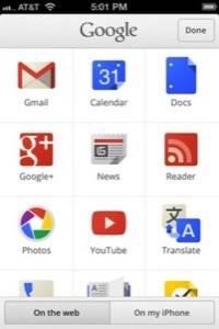
The “Apps” section is a launcher for all the various Google Web apps, which is probably why this app is so good. Google’s other native iOS apps, like Gmail, Translate and especially Voice are weird, hobbled versions of what Google’s Web apps can do in the browser. Google+ was, too, until its recent redesign, which is pretty but still slow and lacking features. The main Google app for iOS has always been fast, pretty and rock-solid. You get the impression that Google wants users to do all their Googling inside it.
For most people, “Googling” means searching, and Google for iOS is almost a better search experience than the desktop. The iPhone now has the benefit of the full-bleed, high-resolution image search and the tappable, swipe-able panels for additional, rich information, which we’ve had in the iPad version since its update in November.

Google clearly wants this app to be nothing less than the primary way iPhone users look for anything. It’s much faster to get a result from this app than from opening Safari and tapping the search box. As long as you’re loading Google pages, it just feels impossibly fast. That’s because Google is constantly preloading things in the background.

“I think touch screens are going to really proliferate. I think you’re going to have a lot of touch surfaces in a lot of places, and it’s going to be interesting to see how people interact with multiple modes of info.”
– Google Search lead designer Jon Wiley
But the best is yet to come to this app. Last week, Google launched the Knowledge Graph, a new layer of information on top of search that pulls together information about the thing you’re searching for right on the page, instead of just listing Web results for it. It already works on the mobile Web version, so if you search in mobile Safari, you’ll see facts and background information there for certain searches.
Google’s Johanna Wright told ReadWriteWeb that those features are coming to the native search apps as well. The Google iOS app is becoming the fastest, best-organized gateway to everything Google does on mobile. Everything except Google+, that is. Despite a shiny redesign this month, Google’s “social layer” still doesn’t get as much attention as search, which is Google’s crown jewel.


