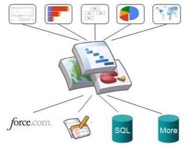
When Google launched its Visualization API in March, it only allowed developers to create applications on top of spreadsheets in Google Docs. Starting today, developers can also use the API to create graphs and gadgets from any data source connected to the web, including SQL databases and Excel spreadsheets. The Visualization API gives developers the ability to build gadgets, using a set of over 40 different types of visualizations, ranging from interactive bar charts and timelines, to maps and gauges.

According to Itai Raz from the Visualization API team, Google also created and documented an open-source Python library that will allow developers to start using the API quickly and which runs on Google’s AppEngine.
Salesforce
Today, Salesforce.com also announced that it has created a number of tools that will make using the Visualization API easier for Salesforce’s own customers and developers. These tools include code snippets and API harnesses and will allow Salesforce customers to create custom reporting and analysis applications for Salesforce’s CRM solution or on top of Saleforce’s newly announced Force.com platform.

Reporting in the Cloud
As Google points out, more and more companies are storing their data in the cloud, so being able to visualize this data and creating good reporting tools is becoming increasingly important. Creating these reports in the cloud as well seems like a logical step, and we expect that quite a few new applications will be created on top of the Visualization API.


