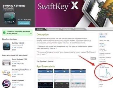
Google has made a small change to the Android Market on the Web involving the addition of installation graphs. These new graphs show up only for apps that have been installed 1,000 times or more, and show the number of installations over the past 30 days.

This lets customers easily see if an Android app is increasingly popular, has steady sales, or peaked then dropped off quickly, which could indicate problem.
Incremental Improvement or Source of Confusion?
The change was first spotted by the folks over on PocketNow, who felt that the addition may not be particularly practical. Commenters there agree, noting that beyond saying “past 30 days” on the bottom, the graphs have no scale to them.
It’s an odd choice from an organization that prides itself in dealing in data. Without a scale, the graphs could actually confuse potential customers, who may see drops and dips or flat lines, and think the app should be avoided. If a scale had been provided, the graph could have shown the app was getting thousands, or tens of thousands, of sales over the past month. Any drops and dips may have been only minor bumps when presented with the overall size of that month’s install base.


