When researching FuseCal this morning, one of the things that made it so appealing to try was the fact that you could just enter in a URL and see the service in action right away. No sign-up forms, no logins. This got us thinking about UI design as it applies to today’s web services. Lately, it seems that less and less services are using sign-up forms…at least, they aren’t requiring you to sign up right away in order to try them out. Instead, the trend seems to be to let you jump right in and get to work. This is definitely a good move, in terms of usability of the site, and it’s not the only UI trend we’ve noticed lately.
Trend #1: Try It Now!
An excerpt from an upcoming book by Luke Wroblewski, “Web Form Design: Filling in the Blanks,” posted on A List Apart helps to point out the issue with sign-up forms on the web. When you’re recommended a new web service to check out, Luke writes “you arrive eager to dive in and start engaging and what’s the first thing that greets you? A form. We can do better.“
Instead of forcing users through a dreadful sign-up process when really they just wanted to take a look, he promotes the idea of “gradual engagement.” After you play around with a web service and get an idea about what it does, you can then choose to take the path to complete your profile in order to create an account, save your work, share the results of your creation, etc.
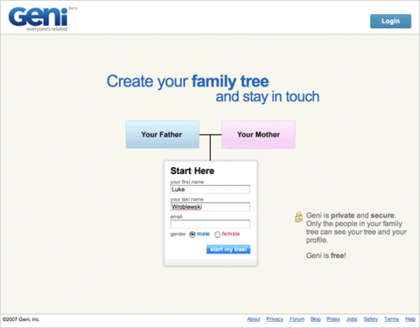
Luke uses a few examples to make his point: one, Geni, an online family tree creation tool lets users make a family tree as soon as they visit the web site. Of course, as you fill out your name, you also enter in your email, so while you’re busy building your tree, you’re also being sent an email from the service, reminding you of your account details if you ever want to return to work on your tree. However, this vague “did I just create an account?” design may have worked for Geni, who generated 5 million profiles in 5 months, we would argue that it should be more obvious whether you are creating an account or not.
Geni’s “Sign Up” Process
Another example of gradual engagement came from TripIt, a service which lets you plan your trips. The interesting thing about TripIt is that the service also ditches the sign-up form for a more interesting option: you just email [email protected] when your travel plans, be them airline confirmation email, hotel confirmation emails, whatever. TripIt extracts your name and email from the form instead of forcing you to enter these details yourself.
Personally, I recall Twiddla (our coverage) an online whiteboarding service, as implementing the “try-before-you-buy” option really well. Upon visiting the Twiddla homepage, a big button “Try it now in the sandbox,” lets you test out the service along with other users in a public sandbox. This way, you can not only try it out for yourself, but you also might see someone else testing a feature you would have otherwise missed. You could also just click “Start a New Meeting” from the homepage and instantly use the Twiddla app with the others who you invite via email, no signing up required.
Twiddla’s Buttons

Trend #2: We Really Care
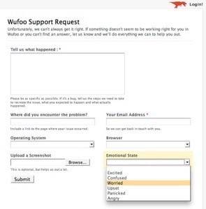
Another trend spotted in the wild is UI design that shows customers that the company cares about them. Take Samatha Warren’s experience with Wufoo, an app that helps you design and build online forms. After finding herself in need of tech support, she noticed an odd form field on the Support Request page: “Emotional State.”
The drop-down included choices like excited, confused, worried, upset, panicked, and angry. Samantha chose the feeling that best described her mood (“worried”, by the way), and then made a startling discovery:
“As I made my selection and moved the curser to hit the submit button a feeling washed over me that was unlike anything I had ever felt with a webservice online. I felt like they cared. I felt confident that my problem would be solved. I felt like I was contacting PEOPLE who have beating hearts, and families, who had felt worried about their missing contact e-mails too. How very humane of them!”
WuFoo’s Support Form
Some say this is cheesy, others find it annoying, but WuFoo isn’t the only service to utilize this idea.
Xobni (our coverage), the “social network in your inbox,” also asks for user feedback by asking you how you feel. They built the “Are You Happy?” box. From a Xobni employee’s blog, Gabor Cselle describes why:
Instead of a popup, we add a little box on the bottom of the sidebar every couple of weeks and ask: “Are you happy?” There are two buttons, Yes and No, and an optional comment field. This is the most lightweight method of collecting user feedback. Note that:
- We’re not popping up an annoying window.
- We ask a simple question.
- There are only two options – “yes” and “no” – and no Send button.
Xobni’s Emotional Feedback Pop-Up
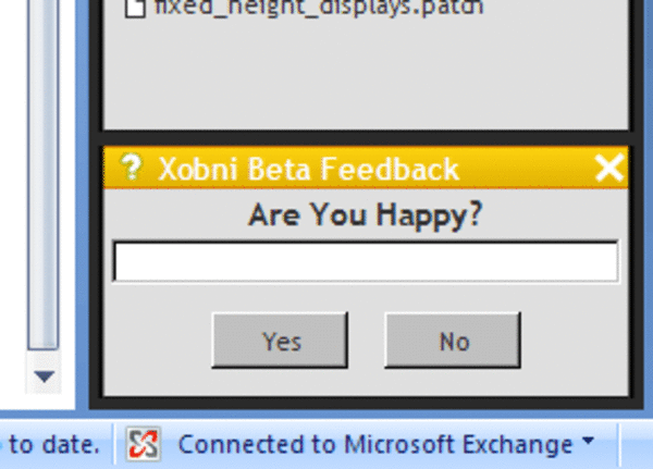
While an argument can be made that opting out of the happiness check should be more readily available, apparently most of their users don’t seem to mind. The feedback is 90% “Yes.”
A more obvious place to find “emotional feedback” form fields is on people-powered customer service site, GetSatisfaction.com, (which, by the way, also forgoes a long sign up process by allowing you to fill in a basic form – name, email, CAPTCHA, with further profile information optional.)
Company feedback, ideas, and questions can tagged with a smiley/frowny face depicting how you feel. After you select the face, a box pops up to allow you to pick out a related word like “happy,” “anxious,” “indifferent,” or “unsure.”
GetSatisfaction’s Emotional Feedback
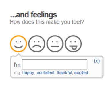
While emotional feedback doesn’t work for everyone – some find it patronizing, especially when they’re reporting a critical issue – an opt-in emotional feedback box could at least gather information about requests/complaints and help a company analyze and prioritize their incoming feedback.
Conclusion
Gradual engagement and emotional feedback are only two of many UI trends seen lately, but two that stand out as they seem to be ramping up in terms of usage by web companies. Hopefully, more companies will take note that there are a number ways to generate accounts for their service besides the traditional, boring sign-up form, or at least start supporting OpenID as an alternative.
As for emotional feedback? It’s a more risky choice since some users detest it, but done right, it could bring a new level of information about to product feedback while making users feel valued by the company.
Do you have any examples of either of these trends that you want to share? And…how does that make you feel?


