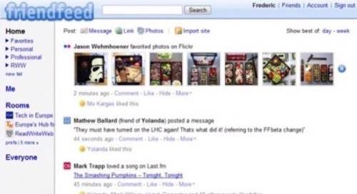
Just a few weeks ago, we reported that FriendFeed had released a new beta version of its site to test a new design for the popular lifestreaming service. Today, FriendFeed released a significant update to this design, which adds some much needed enhancements to the user interface. Specifically, the navigation of the FriendFeed beta site has now been switched to the left, and the post form can no longer be confused with the search form.


Enhancements
FriendFeed has also updated the “All Rooms” page, which now hides any rooms that have been inactive for a while. This is especially handy now that a lot of people use FriendFeed rooms to live-blog events. Whereas before, these rooms would start cluttering your interface pretty quickly, they are now neatly hidden.
It’s also now a lot easier to see who is subscribed to any given room, though the ability to search for rooms is still not available.
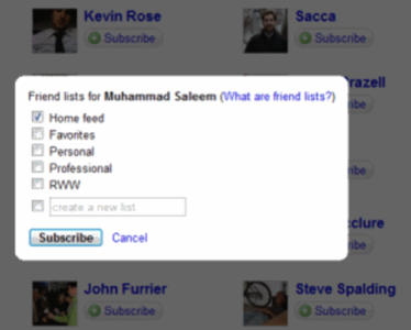
Also new is the option to immediately choose a friend list for any new friends you subscribe to (see screenshot).

Cleaner and Simpler
Overall, the new interface looks considerably cleaner. Our only complaint is that it is sometimes not quite clear if you are surfing the “Everyone” or the ‘Home” tab. The color of the active tab changes from dark blue to black, which is just a bit too subtle.
In general, with very few exceptions, the reactions from FriendFeed users have been positive so far .


