Facebook is rolling out its first iPad today, though at press time it’s not available in the iTunes app store where I live. Screenshots are available though and there’s not much that’s surprising in the design at least. Images are embedded below.

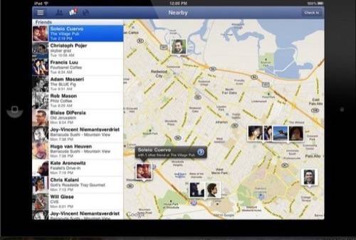
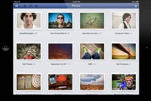
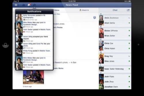
The app relies on big photos for most of its design strength. That makes sense. As the world’s biggest photo sharing network, there’s nothing Facebook could have built that would have pleased all of the people all of the time (hundreds of millions of people) more than a big, full-screen display of photos taken by our own friends. Newsfeed, including apps, and chat look similar to the way they look on the web. Facebook check-ins, displayed on a big map, look different and interesting. Images below, what do you think?
You’ll be able to access the app directly once it’s available here; click the images below for full size view.
How Facebook Mobile Was Designed to Write Once, Run Everywhere
A few questions I’ll be eager to find out the answers to:
- How will the browser inside the Facebook App perform relative to Safari? Will there be anything special about it?
- Facebook on Mobile Safari works ok on the iPad, the app is an alternative to its clumsiness. Will the trade off in terms of functionality given up for stability and responsiveness found be worth it?
- Will people want to chat in IM on an iPad’s on-screen keyboard?
- Is this going to be a case of Facebook swallowing the world? What does this mean for the web? For other apps?
You know that millions and millions of people are going to be trying this app out. Hopefully it will be worth the wait.
