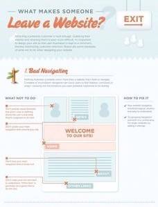
You could say there is no right way to design and build a Web site – but you’ll find plenty of wrong ways. KISSmetrics outlines eight of them with an infographic that answers the question “what makes someone leave a website? If you’re designing or responsible for a site for a business, you might want to pay close and particular attention.

I’m pretty forgiving when it comes to #6 (boring content, boring design) at least when it comes to the boring design part. Why? Content is king, presentation comes second. If a site has the content I’m looking for, I’ll stick around as long as it isn’t hideous or afflicted with some of the other sins mentioned.
For example, obtrusive audio and video? I’m gone. I hate playing “find the tab that’s playing audio” when a site decides to start playing video or audio. Bad content structure is another killer – make it easy to find what I’m looking for. Far too many sites, especially in the enterprise space, make it easy to find what the marketing department wants me to see. That’s not the same thing as what I’m looking for, usually.

My biggest pet peeve, though? Registration requirements. Nine times out of ten, I’m gone before a page finishes loading if I stumble onto a site that requires registration to see what I came for.
KISSmetrics has a pretty good set of rules to live by, if you want to keep visitors on your site longer than it takes to reach the mouse. Did they miss anything? Any pet peeves or tips to share with other site owners?


