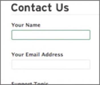
The contact page. It’s a mainstay in the footer navigation of just about any website, especially those run by companies for whom a well-designed contact page can be mission critical. For some smaller companies it can mean the difference between making a profit and losing money.

Follow these essential guidelines to ensure your current and prospective customers can stay in touch without a hassle.
Make It a Form
While it’s temptingly easy to just put a traditional email link on the contact page, this doesn’t lend itself to the best user experience. When clicked, such a link will open the default email client on the user’s machine, which may or may not be what they actually use. If I’m a Gmail or Yahoo Mail user, I don’t want to fire up my as-yet-unconfigured copy of Outlook Express when I click a link to email somebody. While savvier Web users know to copy the email address and paste it into their email service of choice – or may even have their browser set up to do it for them – you can’t count on all of your prospective customers being Firefox plugin-slingin’ uber-geeks.
Instead, use a Web form. Whether you use a third-party product like Wufoo or FormSite or have your Web guru build it themselves, a clean, easy-to-use form is going to get more of a response than a simple email link.
Keep It Simple
As with all things in Web design, simplicity is key. Your contact form should only ask your would-be customers for the information you absolutely need to know. In most cases, it’s as simple as name, email and a description or body field. Only ask for the user’s phone number if it’s absolutely critical to your business to do so. Avoid asking for their mailing address unless you plan on mailing them something (with their consent, of course). The more fields a form has, the fewer responses it’s likely to have.
In some organizations, there are several different departments, each with a different contact person. Perhaps some inquiries would best be directed to a sales contact, whereas others would be more appropriate for a technical person. Keep the process clean by working these options into a simple drop-down menu labeled something like “How can we help you?” or “Topic:”.
While the form should be the focus of your contact page, don’t hesitate to offer alternative methods of communication in a sidebar. A call-out box containing a phone number and social media profile links would be a nice touch.
Note: A contact form is a great way to collect email addresses for your mailing list, but it’s best to give the person filling it out the option to sign up for email via a check box.
Get Creative, But Don’t Go Crazy
The contact page is a great opportunity for a designer to come up with something truly inventive and beautiful to look at. But as Web usability guru Jakob Neilsen always warns, if it’s not immediately intuitive how to navigate or use any part of a site, users will leave in a hearbeat. The average user should be able to immediately locate and fill out each field on the form and click submit. At that point, they should receive a clearly-worded confirmation that their message went through and they can be on their way.


