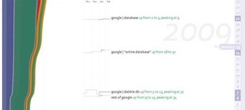
The problem with most analytics platforms is that we can’t see the forest for the trees. Instead of looking for daily spikes in a traffic rating, it’s more important for us to know what trends are spiking over time. From there we can make decisions to improve our businesses. In an effort to make a more useful analytics dashboard, the makers of database tool Dabble DB created Trendly.

ReadWriteWeb last looked at Dabble DB when the company launched a social to-do list for Facebook. While the product played on all of Dabble’s strengths of data capture and collaboration tools, the tool lacked consumer sex appeal. With Trendly, the company is returning to it’s quant roots.

Trendly allows users to track analytics with up to a three year history. Instead of showing you every dip and curve in the metrics of your site, for $5 dollars per month the company offers a better alternative. Users view highlighted site changes via a newsfeed and timeline. In what is clearly a different approach from the basic Google Analytics interface, Trendly offers color coded layers displayed alongside the newsfeed. Each layer represents the timeline of a single keyword and wider layers represent the keywords most searched. The service also allows users to click on keywords to bring up related word clusters and the percentage of search around each. Trendly also tracks referrals, content and ad campaigns. Once the service is set up, users can pull reports on content traffic analysis, AdWords conversions, search, referrals and direct traffic. Given Dabble’s track record in putting together great tracking and database systems, Trendly is certainly worth a try. To check out the site visit trendly.com.


