The British Broadcasting Corporation quietly launched a beta version of their spiffed up new homepage last week.

The new page, which the Beeb has dubbed a “lick of paint,” draws on a number of so-called web 2.0 design aesthetics: rounded corners, large fonts, big buttons, a soft color palette, and a liberal dash of AJAX.
But most strikingly, the beta BBC page is comprised of drag and drop content modules similar to Netvibes or iGoogle (named in a blog post by BBC’s UX and Design head as inspirations). The site, says the BBC, was designed around the ideas of simplicity, personalization, and localization, as well a bit of nostalgia: the homepage prominently features an accurate analogue clock — the BBC was founded in 1922, after all, and the media network says that test users have found the clock, an “homage to the ‘golden days’ of analogue programming, bizarrely reassuring.”
For now, the BBC site is using a cookie to remember user preferences, but the company plans to integrate the personalization options into a forthcoming identity management system to be launched sometime in January. The redesign was completed in a relatively short three-month period, and the BBC joins CNN, USA Today, and AOL News among major news web sites that have launched newer, more “web 2.0” designs this year.
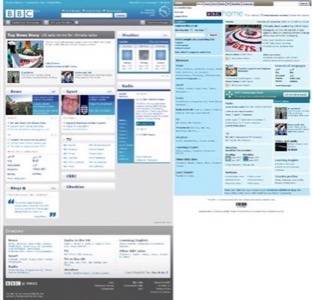
The BBC’s new design on the left vs. the old design on the right.
In June we compared the redesign efforts from the aforementioned major US news web sites. Those sites tended to emphasize user interaction (via comments, voting, story submission, etc.) or audio and video, while the BBC is emphasizing personlization. Which method makes more sense? It probably depends on your audience. The BBC’s homepage serves users of not just their web site news service, but also their television and radio networks, so the portal route might make more sense. The BBC has a lot of content from various sources that users want to get to, and letting users define which content they see first may prove a popular feature.
In general, the BBC’s beta site is much cleaner and easier to scan. The old (current) BBC web site is a mess of text links with no clear navigation. The new site still has a bit of navigation headache (i.e., I still have to dig through a block of links at the bottom of the page to get to the tech section), but because the content widgets can be personalized and moved, I can rework the page such that it shows me the latest tech headlines instantly at the very top.
The new design also places a greater emphasis on search, making it more apparent how to find what you’re looking for, by placing a larger search box in a familiar place on the page. That is a vast improvement over the current situation, but I’d still like to see a cleaner, easier-to-navigate dedicated site navigation.
It is interesting to note that this is not the BBC’s first attempt at personalization. Their myBBC service from 2001 was something like a stripped down, BBC-only version of MyYahoo! While myBBC ultimately didn’t pan out, something tells me they may have more luck this time around. What do you think?


