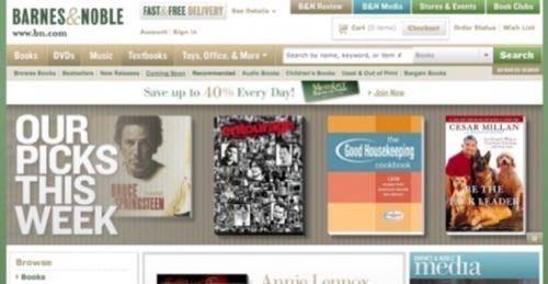
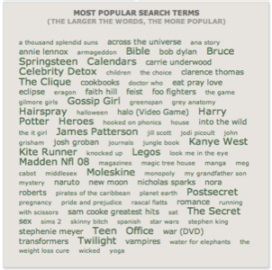
Barnes & Noble.com has launched a re-design, with several new web 2.0 features – including “One on One” podcasts, a large tag cloud on the frontpage, a “See Inside” program that offers a virtual book-reading like experience, and a service called “Live at Barnes & Noble” where you can view webcasts of readings at member stores. Another new feature is B&N Review, a daily magazine with reviews and interviews.

The goal of the re-design was to add more “motion”, as well as more content, interactivity, and community. The AP report also noted that Barnes & Noble.com “has become increasingly important to Barnes & Noble Inc. […] The online seller’s percentage of the superstore’s total sales have doubled in the past five years to 10 percent.”

Joe Wikert has a nice review of the re-design, noting that it is “disappointing to see that B&N’s page has nothing to offer on the widget front.” Indeed check our recent review of Random House’s widget and web services program to see what B&N could have done. Wikert also says it is light on customization options.
Barnes&Noble has a long way to go to catch up with Amazon.com, the online book store market leader – in both sales and innovation. Also Borders recently announced a beta design, which Joe Wikert has info on (I found a great new feed tonight, subscribed Joe!).
Overall, a lot of nice new functionality in the new B&N – but it’s still far from Amazon.com’s level. No recommendation technology, no widgets, no web services, no RSS, little customization. Still, it has some nice multimedia and uses many of the UI elements popularized by Amazon.com (e.g. wishlists). Its current user base will be pleased, although there doesn’t seem to be much to attract new users.


